
Picture this: you're trying to figure out if it's going to rain tomorrow. You wouldn't just stick your head out the window and guess. Instead, you'd look at a weather map, track storm systems, and identify patterns that usually lead to rain.
Technical analysis is the exact same idea, but for financial markets. It's the skill of using past price charts and trading data to anticipate where prices might go next.
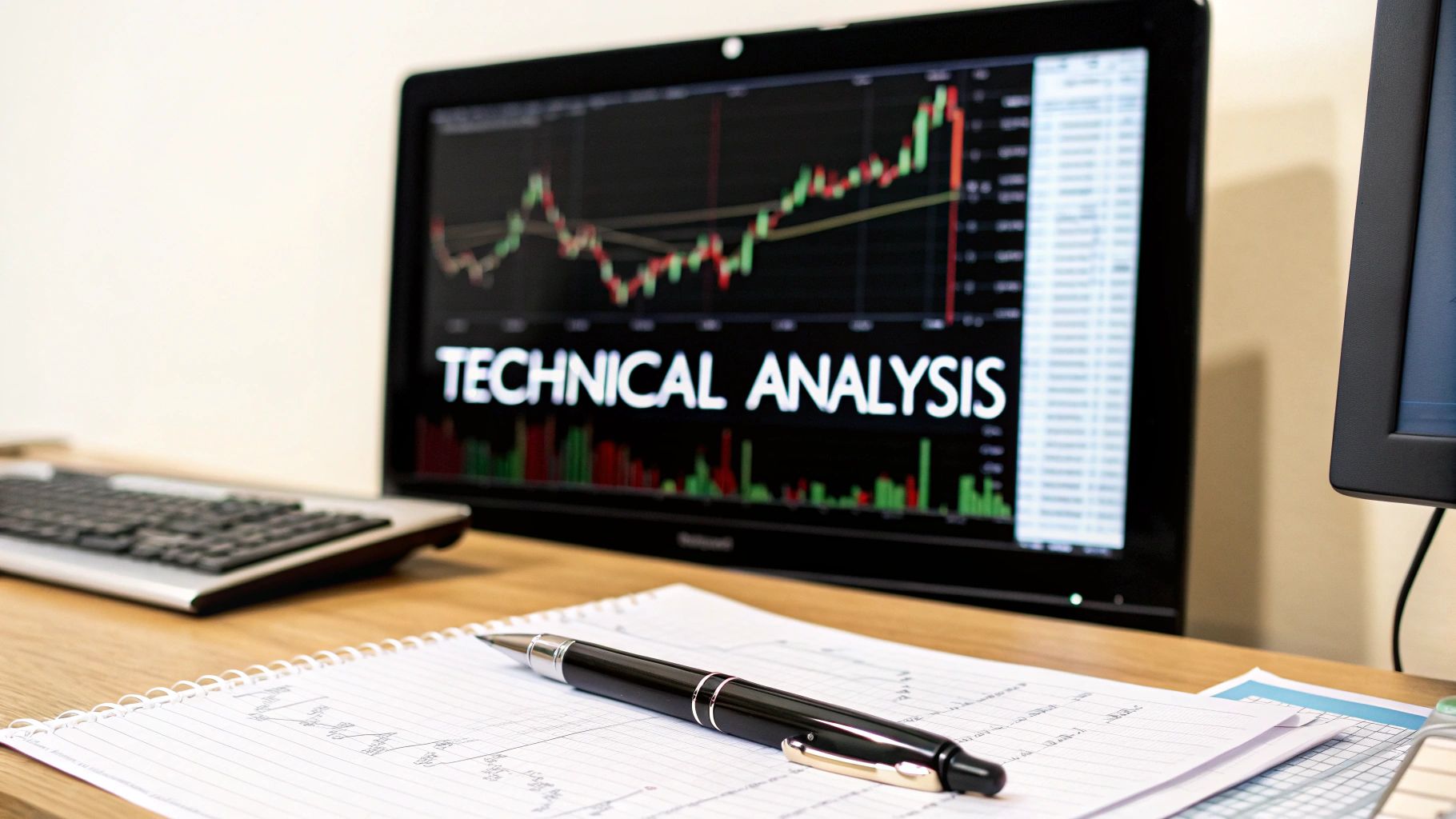
What Is Technical Analysis, Really?
At its heart, technical analysis is all about studying the history of an asset's price and trading volume. This approach is built on a key belief: all the important information about a company—from news announcements to earnings reports—is already baked into its current price.
This is a big departure from fundamental analysis, which dives deep into a company's financial health. For a technical analyst, the chart itself is the only truth that matters.
Think of it as learning to read the market's mood. Every upswing and downswing, every surge in trading activity, tells a story about the constant tug-of-war between buyers (the "bulls") and sellers (the "bears").
The goal isn't to find a crystal ball that guarantees a 100% correct prediction every time. Instead, technical analysis is about identifying high-probability setups and managing risk based on patterns that have appeared time and time again.
Once you learn to spot these patterns, you can start making much more informed trading decisions. It's a game-changing skill that helps turn what looks like a chaotic chart into a clear, visual language.
Two Sides of the Same Coin
To really get a handle on technical analysis, it's helpful to see how it stacks up against its counterpart, fundamental analysis. It's not about one being better than the other; in fact, many successful traders blend both. They just ask very different questions and look at completely different information.
Here’s a quick breakdown to help clarify the distinction.
Technical vs Fundamental Analysis Core Differences
| Aspect | Technical Analysis | Fundamental Analysis |
|---|---|---|
| Primary Focus | Price charts, patterns, and trading volume. | Company financials, industry trends, and economic data. |
| Main Goal | To predict future price movements based on historical data. | To determine an asset's intrinsic or "fair" value. |
| Time Horizon | Typically used for short- to medium-term trading. | Generally used for long-term investing. |
| Key Question | "What is the market doing?" | "Why is the market doing this?" |
This difference is the core of it all. As someone focused on technicals, your world revolves around the chart. You operate on the belief that price action tells you everything you need to know to make a trade.
How Ancient Traders Shaped Modern Analysis
Technical analysis feels like a product of the digital age, born from supercomputers and lightning-fast markets. The reality, however, is that its core principles are centuries old, a testament to the timeless nature of market psychology. For a beginner, understanding this history is a big deal—it builds confidence. You’re not just learning a modern fad; you’re tapping into a discipline refined over generations.
Our story begins far from Wall Street, in the bustling rice markets of 18th-century Japan. This is where a legendary trader named Homma Munehisa developed his game-changing insights. He had no software or fancy algorithms, just a profound grasp of human emotion and how it steered prices.
Homma saw that the price of rice wasn't just about simple supply and demand. It was pulled and pushed by the collective fear and greed of everyone in the market. To get a handle on this emotional battlefield, he created a brilliant way to map out price action: what we now call candlestick charts.
The Birth of Candlesticks
Each candle told a story, capturing the tug-of-war between buyers and sellers within a specific timeframe. Homma's "Sakata Rules" were one of the first known attempts to analyze market patterns, creating a foundation for many of the techniques we still use. His methods were so effective that he eventually became a financial advisor to the Japanese government.
For a long time, this powerful charting tool was a well-kept secret of the East. It took quite a while before these ideas found their way to the West and blended with Western analytical thinking.
Homma Munehisa's central insight was that markets are driven by human emotion. By tracking price history, he believed one could predict future movements because human emotional patterns—fear, greed, hope—are consistent and repeatable over time.
The Western Pioneers
The ball really got rolling in the Western world in the late 19th century with Charles Dow, one of the founders of The Wall Street Journal. He didn't just create the Dow Jones Industrial Average as a market snapshot; he designed it as a barometer for the entire economy's health.
Dow theorized that the market moves in trends, just like the ocean's tides, with primary, secondary, and minor waves. These ideas became the cornerstone of what we know today as Dow Theory, a fundamental part of modern technical analysis.
This rich history shows that technical analysis is anything but a new invention. Its roots run deep, with early versions popping up in 17th-century Dutch markets and, most famously, the Japanese rice markets. The groundwork laid by pioneers like Homma and Dow was later built upon by thinkers like Robert Edwards and John Magee. Their 1948 book, Technical Analysis of Stock Trends, is still considered a must-read classic.
To truly appreciate the tools you're about to learn, it's worth taking a moment to discover more about the history of technical analysis and see how these historical insights grew into the strategies we use every day.
Learning to Read the Story in the Charts
If you're going to get into technical analysis, your first stop has to be the price chart. Think of it as your map. It's the language of the market, turning what looks like random chaos into a visual story you can actually follow. Getting comfortable reading these charts isn't just a first step—it's the most important one.
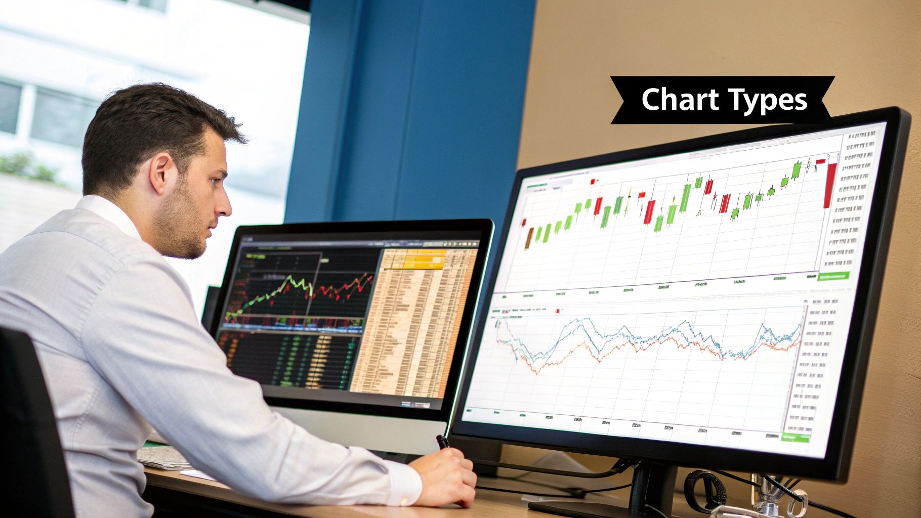
You’ll come across a few different chart styles, but traders tend to gravitate toward three main types. Each one shows you the market's pulse with a different level of detail, but one has become the clear favorite for good reason.
- Line Charts: These are the most basic charts you'll see. They simply connect the closing prices over time with a single line. They’re fantastic for getting a quick, big-picture view of a trend, but they leave out all the drama that happened during the trading day.
- Bar Charts: A step up in detail, bar charts show you the open, high, low, and close (OHLC) prices for each period. They pack in a lot more information, but honestly, they can look pretty busy and confusing until you get used to them.
- Candlestick Charts: Just like bar charts, candlesticks give you the full OHLC picture. The key difference is their design. It’s far more visual and intuitive, which is why most traders today live and breathe by them.
Why Candlesticks Are a Trader’s Best Friend
Candlestick charts have been around for centuries, first used by Japanese rice traders, and their popularity has lasted for a reason. They have an uncanny ability to make complex price action and market sentiment feel simple and immediate.
It helps to think of each individual candlestick as a mini-story, a snapshot of the battle between buyers (the bulls) and sellers (the bears) over a set amount of time.
As you can see, the candles line up one after another, creating patterns and revealing the flow of the market. This visual approach makes technical analysis for beginners feel much less intimidating.
At its heart, a single candlestick tells you who won the fight. A green (or white) candle means the buyers came out on top, pushing the price higher. A red (or black) one means sellers dominated. This simple color-coding gives you an instant read on the market's mood.
To really get the hang of this, you need to know the anatomy of a candlestick. It’s made of two parts: the body and the wicks.
- The Body: This is the thick, main part of the candle. It shows you where the price opened and where it closed.
- The Wicks: Also called "shadows," these are the thin lines that poke out from the top and bottom of the body. They represent the absolute highest and lowest prices hit during that period.
Decoding Bullish and Bearish Signals
The magic happens when you look at how the body and wicks relate to each other.
A bullish candle (usually green) pops up when the closing price is higher than the opening price. Simple enough—it tells you that buyers were in the driver's seat.
On the flip side, a bearish candle (usually red) appears when the close is below the open. This is a clear signal that sellers took control and drove the price down. The wicks add another layer to the story. For example, a long wick at the top of a candle suggests that buyers tried to rally but got smacked down by sellers before the period ended.
This is your starting point. Once you have this down, you can move on to more advanced concepts. To dive deeper, check out our complete guide on understanding candlestick charts, which gets into specific candle shapes and what they signal.
By learning to interpret these individual stories, you'll start to see the market's bigger picture emerge, one candle at a time. This skill is absolutely essential for what comes next: spotting the major chart patterns that can inform your trades.
Recognizing Your First Chart Patterns
Once you've got the hang of reading individual candlesticks, it’s time to start seeing the bigger picture they create together. Think of chart patterns as the recurring plot twists in a market's story. They are distinct shapes formed by price action that often hint at what's coming next. It's almost like learning to read the market's body language.
For anyone new to technical analysis, these patterns are a fantastic starting point because they give you a visual roadmap. Broadly speaking, they fall into two camps: patterns that suggest a trend will keep going, and those that warn it’s about to turn around.
Continuation Patterns: The Brief Intermission
Continuation patterns are like a quick breather in the middle of a strong trend. They show the market pausing to consolidate its recent moves before likely continuing in the same direction. Spotting one can be your cue to hold a position or find a good spot to jump in on the prevailing trend.
Let's look at two of the most common ones: Flags and Pennants.
- Flags: This pattern really does look like a flag on a pole. It starts with a sharp, almost vertical price move (the "flagpole"), followed by a brief period where the price consolidates within a small, sloping rectangle (the "flag"). A bullish flag shows up in an uptrend, while a bearish one appears in a downtrend.
- Pennants: These are close cousins to flags. They also form after a big price move, but the consolidation phase creates a small, symmetrical triangle that looks like a little triangular flag or pennant.
The psychology behind these is pretty straightforward. After a major run-up or sell-off, some traders cash out while new ones step in. This tug-of-war causes the price to chop sideways for a bit before the dominant trend takes over again.
Reversal Patterns: The Dramatic Plot Twist
Reversal patterns are the real drama queens of the chart. They signal that the current trend is running out of gas and might be about to U-turn. Catching these early can be the key to getting out of a trade before it goes south or positioning yourself to catch the next big move.
You’ll often see these patterns forming at key support and resistance levels. Support is a price floor where a downtrend tends to pause because buyers step in. Resistance is the opposite—a price ceiling where an uptrend often stalls as sellers emerge.
The image below gives you a great visual of how price behaves around these levels and what happens when it finally breaks through.
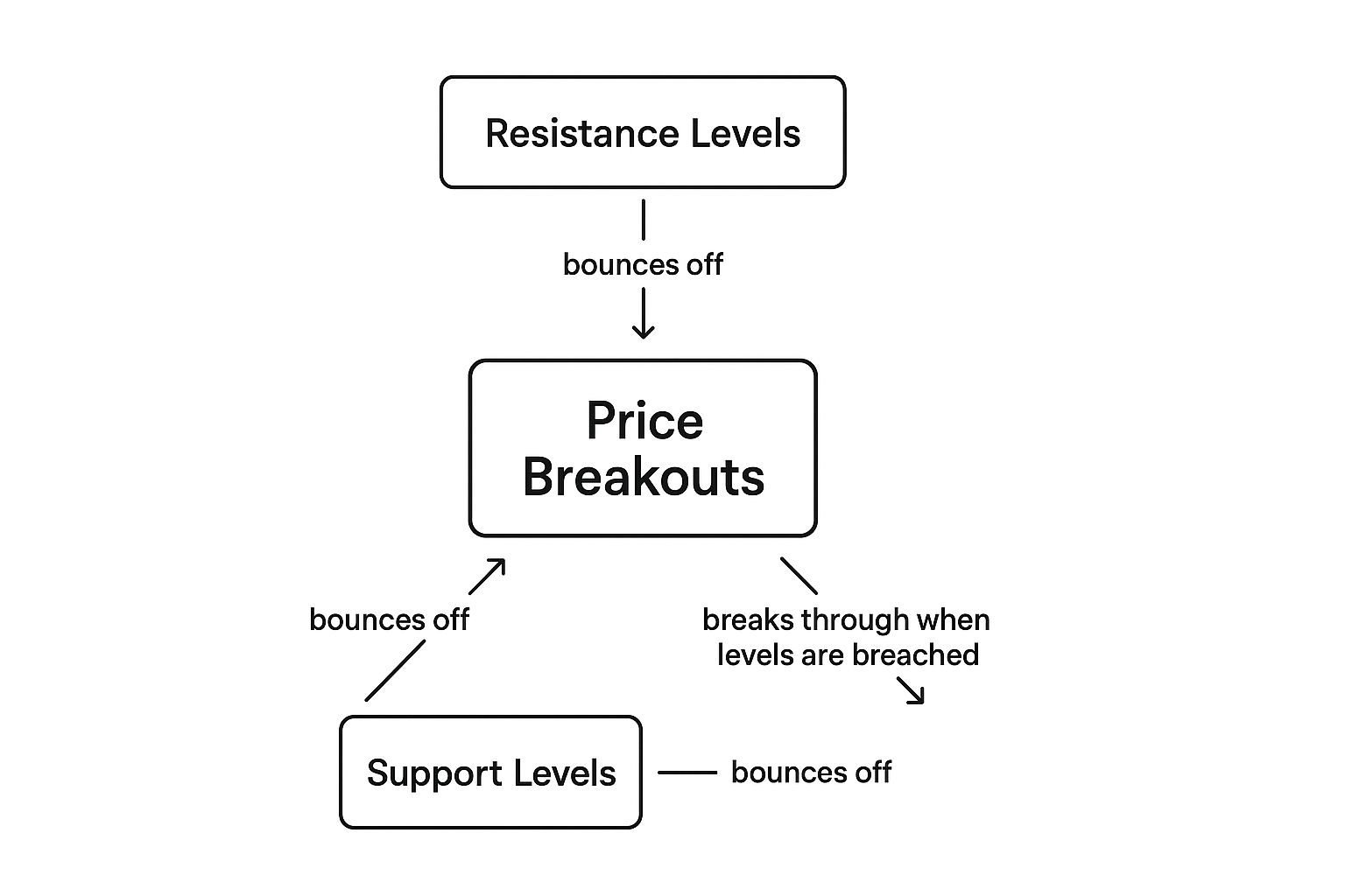
As you can see, the price often bounces between support and resistance like a pinball until one side finally gives out. That breakout can kick off a powerful new trend, which is why understanding this dynamic is so important.
Double Tops and Bottoms
A Double Top is a bearish pattern that looks like a capital "M." It happens when the price hits a resistance level, pulls back, rallies back up to that same level, and gets rejected again. It's like the market knocked on the ceiling twice but couldn't break through. This is a strong sign that buying pressure is fading and sellers are taking over.
Its bullish counterpart is the Double Bottom, which looks like a "W." Here, the price drops to a support level, bounces, falls back to that same support, and finds strong buying interest that prevents it from falling further. This tells you the sellers have likely exhausted themselves, and a new uptrend could be on the horizon.
Head and Shoulders
The Head and Shoulders is another classic reversal pattern. It’s made up of three peaks: a smaller peak (the left shoulder), a higher middle peak (the head), and a second smaller peak (the right shoulder). All three peaks fall back to a common support line called the "neckline." A decisive break below this neckline is a major bearish signal.
These patterns aren’t just random shapes; they are a visual representation of market psychology. A Head and Shoulders, for instance, shows a failing rally. Buyers make one last, strong push (the head), but they don’t have the momentum to sustain it, and eventually, the sellers gain the upper hand.
Some studies suggest that well-formed patterns like the Head and Shoulders or Double Top can predict reversals with a success rate somewhere between 55% and 65%. Their reliability often gets a boost when the pattern is confirmed by a spike in trading volume.
Simply spotting these patterns is a great skill, but the real power comes from combining them with other indicators to build a solid trading plan. Of course, it all starts with knowing what you’re looking at. You can sharpen your chart-reading skills by learning how to read stock charts with our in-depth guide. Mastering these visual cues on your OTC Charts MT4 platform is what will help you turn raw market data into truly actionable insights.
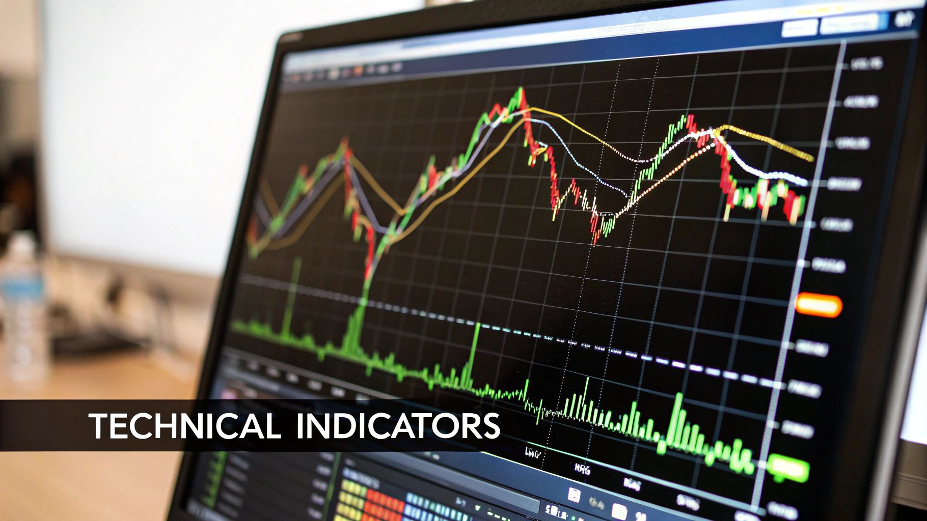
Using Your First Trading Indicators
If price charts tell the market’s story and patterns are the major plot twists, then technical indicators are the specialized tools that measure the story's momentum. Think of them as mathematical calculations, based on an asset's price or volume, that you can lay right over your chart for a clearer, data-driven perspective.
For someone just starting, the sheer number of indicators can feel like trying to drink from a firehose. There are literally hundreds, each with a unique purpose. The key is to ignore the noise and start with just a few of the most reliable and widely used ones. Let's build your foundational toolkit.
Smoothing Out the Noise with Moving Averages
One of the very first indicators any trader should get comfortable with is the Moving Average (MA). Its job is simple but incredibly powerful: it smooths out the chaotic, short-term price swings to reveal the true, underlying trend.
Imagine you're driving down a really bumpy road. The constant jolts make it tough to tell if you're generally heading uphill or downhill. A moving average acts like a sophisticated suspension system, absorbing those bumps so you can get a smooth ride and a clear sense of direction.
You'll primarily run into two types:
- Simple Moving Average (SMA): This is the most basic version. It calculates the average price of an asset over a set number of periods, like the last 50 days. It gives equal weight to every price in the period.
- Exponential Moving Average (EMA): The EMA is a bit more dynamic. It also calculates an average, but it gives more weight to the most recent prices. This makes it more responsive to new information and quicker to signal a change in trend.
On your OTC Charts MT4 platform, adding MAs is a breeze. A common strategy is to use two of them—one short-term (like a 20-period EMA) and one long-term (like a 50-period EMA). When the short-term MA crosses above the long-term one, it’s often seen as a bullish signal. A cross below is typically bearish.
Measuring Market Extremes with RSI
Next up is the Relative Strength Index (RSI). This is what's known as a momentum oscillator, which sounds complex, but its purpose is straightforward. The RSI measures the speed and magnitude of price movements, plotting them on a scale from 0 to 100.
Its primary job is to help you spot when an asset might be "overbought" or "oversold." Think of it like a rubber band. Stretch it too far in one direction, and it's bound to snap back.
- Overbought: An RSI reading above 70 suggests an asset has been bought up aggressively and might be due for a price drop. The rubber band is stretched tight on the upside.
- Oversold: An RSI reading below 30 suggests the asset has been sold off heavily and could be poised for a rebound. The rubber band is stretched to its limit on the downside.
The RSI is fantastic for helping you time your entries and exits. For example, if you see a bullish chart pattern forming, noticing that the RSI is also moving up from oversold territory can give you much more confidence in the trade. It’s also a key component in a complete support and resistance trading strategy, helping confirm when those levels are likely to hold.
Spotting Momentum Shifts with MACD
The final indicator in our starter pack is the Moving Average Convergence Divergence (MACD). This tool is all about revealing changes in the strength, direction, and momentum of a trend. While it's built using moving averages, it presents the information in a completely different, highly visual way.
The MACD consists of two lines (the MACD line and a signal line) plus a histogram. As a beginner, the most important signal to watch for is the crossover.
When the MACD line crosses above the signal line, it’s a bullish signal suggesting that upside momentum is building. When it crosses below, it’s a bearish signal indicating that downside momentum is picking up.
The histogram gives you a great visual shortcut for this. When its bars are above the zero line and getting taller, bullish momentum is strong. When they're below the zero line, bearish momentum is in control.
These three indicators—the MA, RSI, and MACD—form a powerful trio for any new trader. They help you see the trend, measure momentum, and spot potential turning points in the market. Mastering them is a huge step toward making informed trading decisions.
Building Your First Trading Strategy
Reading about technical analysis is one thing, but actually using it is where the real learning happens. It’s time to take what we’ve discussed—all those patterns and indicators—and put them to work. Let's walk through building a simple, practical strategy right inside your OTC Charts MT4 platform.
This is the bridge from theory to practice. We're going to stop talking about concepts and start applying them to a real-world chart.
Setting Up Your Chart
First things first, fire up your trading platform and pick an asset to analyze. Think of your chart as a blank canvas. Your job is to add the right tools to help you see what's really going on with the price.
- Add a Moving Average: Let's start with a 50-period Exponential Moving Average (EMA). This isn't just a random line; it acts as a dynamic trend filter, smoothing out the noise and giving you a quick visual on whether the market is generally heading up or down.
- Add the RSI: Next, pop the Relative Strength Index (RSI) onto the area below your main price chart. The default settings are fine. Just keep an eye on those two magic numbers: 70 (overbought) and 30 (oversold).
- Draw Trendlines: Now, get your hands dirty. Look for clear peaks and valleys on the chart and practice connecting them with trendlines. This simple act of drawing helps you manually frame the price action and identify potential support and resistance zones before they become obvious.
With these three elements in place, your chart is no longer just a bunch of candlesticks. You now have a custom dashboard where the EMA defines the trend and the RSI measures its underlying strength.
Constructing a Hypotothetical Trade
Alright, let's bring it all together with a hypothetical trade.
Imagine you're watching a stock that's been in a steady downtrend. You see the price drop, bounce, and then fall back to the exact same level before it starts to creep up again. What you've just spotted is a potential Double Bottom—a textbook bullish reversal pattern.
That's a great start, but a pattern by itself is just a hint, not a command. You need more evidence.
A solid trading decision is rarely based on one signal. The real magic happens when you find several different, unrelated clues that all point in the same direction. This is a powerful concept called confluence.
So, you look for confluence. Glancing down at your RSI, you notice something interesting. While the price made a second, equal low, the RSI made a higher low. This is classic bullish divergence, and it’s a huge clue that the bears are running out of steam.
This screenshot shows a similar setup, where indicators on the OTC Charts MT4 platform add crucial depth to the price action.
In this view, you can see how the indicators living below the main price window provide vital context, helping you make a much more informed decision.
Suddenly, your trading idea is looking much more robust. Let's recap what you have:
- A bullish reversal pattern (Double Bottom).
- Bullish RSI divergence, confirming that selling momentum is fading.
- The price has crossed back above the 50-period EMA, suggesting the short-term trend might be turning positive.
This powerful combination gives you a high-conviction reason to consider a trade. By layering your analysis and demanding that multiple signals agree, you shift from guessing to making strategic, evidence-based moves. This disciplined approach is the heart and soul of any good trading strategy.
Common Questions from New Traders
Diving into technical analysis for the first time always stirs up a lot of questions. That’s perfectly normal. Getting straight answers is the first step toward building the confidence you need to read charts and make your own trading decisions.
Let's tackle some of the most common questions I hear from traders who are just starting out.
One of the first things people ask is, "How much money do I actually need to start?" The honest answer? There's no magic number. Your initial focus shouldn't be on hitting a jackpot but on learning the ropes. Most brokers offer demo accounts where you can trade with virtual money, which is the perfect place to practice until you're ready for the real thing.
Another big one is about accuracy: "Is technical analysis always right?" In a word, no. Technical analysis for beginners isn't about gazing into a crystal ball that perfectly predicts the future. It’s about spotting scenarios where the odds are more likely to be in your favor.
The real goal is to stack probabilities on your side, not to find a system that never loses. Successful trading is a game of managing risk and knowing how to handle it when a trade inevitably goes against you.
Can I Succeed Without a Finance Degree?
You absolutely can. Many of the best traders I know don't have a fancy finance degree. Technical analysis is a visual skill—it's about pattern recognition and understanding the psychology driving the market, not complex financial modeling.
Here are a few other things people wonder about:
- How long does it take to learn? You can get a handle on the basics in just a few weeks if you're dedicated. True mastery, however, is a journey. The secret is consistent practice on live charts.
- Which indicators should I start with? It's easy to get overwhelmed. My advice is to stick with the workhorses we've already covered, like Moving Averages and the RSI. Build a solid foundation with those before you even think about adding more complex tools to your charts.
Your trading journey starts with a little curiosity and a commitment to learn. By focusing on these core ideas and getting some hands-on experience, you'll be well on your way to building a solid skillset.
Ready to put these concepts to work with professional-grade tools? OTC Charts MT4 gives you the advanced, real-time charting you need, all inside the popular MetaTrader 4 platform. Take your analysis to the next level by getting started at https://otc-charts-mt4.com.