
At its heart, reading a binary options chart is about one thing: figuring out where an asset's price is headed. You're looking at its past movements—the price on the vertical Y-axis plotted against time on the horizontal X-axis—to make a simple "yes" or "no" prediction. Will the price be above a certain point when the clock runs out? Or below it? That's the whole game. Getting good at this means learning to spot patterns and act on signals hidden within the visual data.
Your First Steps in Chart Analysis
Staring at a trading chart for the first time can be intimidating. All those flashing colors and jagged lines look like a chaotic mess. But once you know what you're looking at, you'll see it’s just telling a story—the story of a constant tug-of-war between buyers and sellers.
Being able to read these charts is absolutely fundamental. Binary options are a simplified, high-risk way to trade, but your success still hinges on understanding the underlying asset's price action. Whether you're trading stocks, commodities, or currencies, the chart is your window into market behavior. This skill is crucial for identifying trends and volatility, which is what helps you predict that binary outcome. As noted in a detailed binary options market report, the market is largely driven by retail traders, and chart analysis is their primary tool.
Think of this section as your basic training. We'll start with the absolute essentials to give you a solid footing before we dive into more advanced strategies.
Understanding the Core Chart Elements
Every binary options chart you encounter, no matter the broker or platform, shares a few universal components. Getting comfortable with these is your first real step toward building analytical confidence. They provide the basic context for everything else.
To get you started, here’s a quick breakdown of what you'll find on any chart and why it matters for your trading.
| Core Chart Elements at a Glance |
| :— | :— | :— |
| Element | What It Represents | Why It's Important for Trading |
| Asset Name | The specific financial instrument being traded, like EUR/USD, Gold, or Apple (AAPL) stock. | You need to know exactly what market you're analyzing to apply the correct strategy. |
| Timeframe | The duration each data point (e.g., one candlestick) represents, ranging from 15 seconds to a full day. | Shorter timeframes show more volatility and noise, while longer ones reveal major trends. |
| Price Axis (Y-Axis) | The vertical scale displaying the asset's price. | This shows you the what—the actual price levels the asset is hitting. |
| Time Axis (X-Axis) | The horizontal scale showing the progression of time. | This shows you the when—how price has behaved over a specific period. |
| Expiration Line | A vertical line on the chart marking the exact moment your trade will close. | This is your finish line. Your prediction must be correct at this precise moment. |
These elements are your map and compass. Once you can instantly identify and understand them, you're ready to start adding more powerful tools like indicators and trend lines to your analysis.
Key Takeaway: Your entire job as a binary options trader boils down to this: predicting where the price on the Y-axis will be when it reaches the Expiration Line on the X-axis.
Choosing The Right Chart For Your Trading Style
Picking the right chart isn't just a matter of preference; it fundamentally changes how you see the market and spot potential trades. Think of it like this: you wouldn't use a blurry photo to identify a face in a crowd. You need clarity and detail, and the same goes for your charts.
Your choice of chart will be one of the first and most important decisions you make. Let's break down the common options you'll find on platforms like OTC Charts MT4.
Line Charts: The Simple Overview
A line chart is as basic as it gets. It simply connects the closing prices over a period, giving you a clean, single line.
For someone just starting, this simplicity can be a huge plus. It cuts out the noise and gives you a bird's-eye view of the general trend. Is the price moving up, down, or sideways? A line chart answers that question instantly. The downside? It hides all the drama that happened within each period, like the price highs and lows.
Bar Charts: Adding More Detail
Bar charts, or OHLC charts, are the next step up. Each bar gives you four crucial data points for a single period:
- Open: The small horizontal dash on the left.
- High: The very top of the vertical bar.
- Low: The very bottom of the vertical bar.
- Close: The small horizontal dash on the right.
This is a big improvement. You can suddenly see the volatility and the full trading range for each session. However, they can be a bit awkward to read quickly. It takes some real practice to glance at a bar chart and immediately grasp the market's story, which is why most experienced traders move on to the next type.
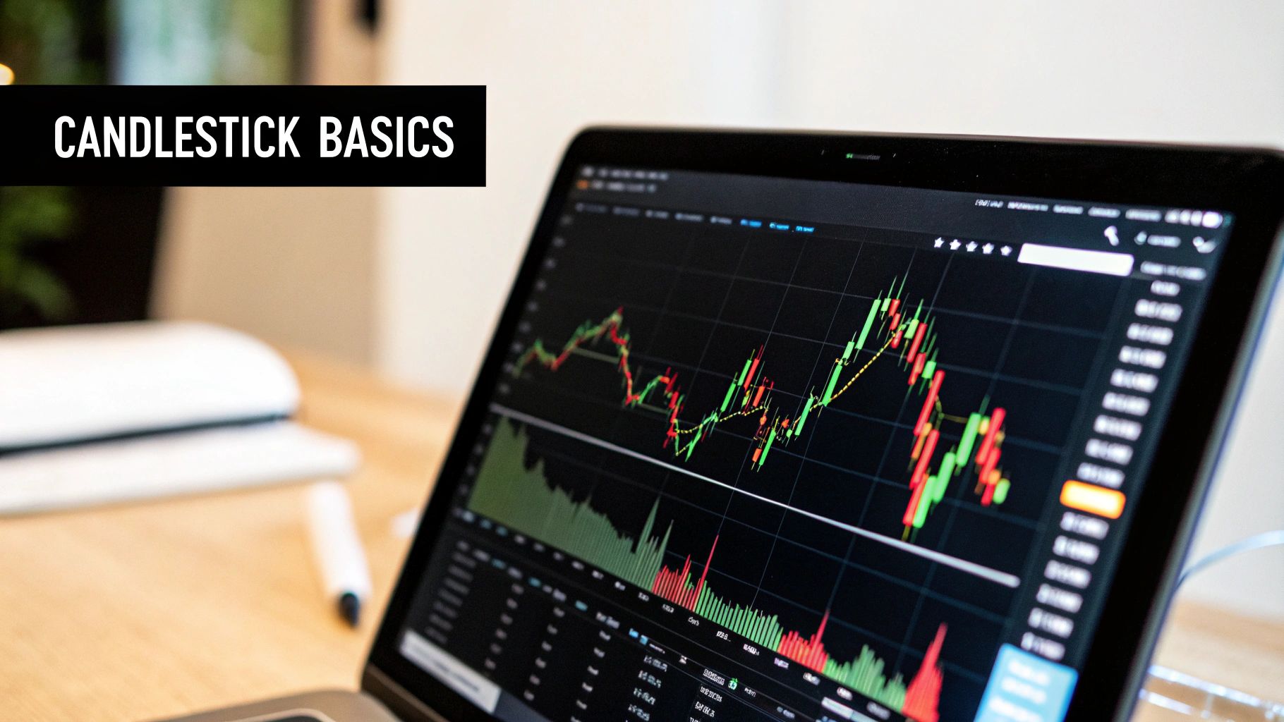
Candlestick Charts: The Trader's Choice
There's a reason you see candlestick charts everywhere—they are the gold standard for technical analysis. Like bar charts, they show the open, high, low, and close, but they do it in a far more intuitive and visually rich way.
Each "candle" has a rectangular body and thin lines called wicks. The body represents the distance between the open and close price, and its color tells you the direction instantly—green for a price increase, red for a decrease. The wicks show the highest and lowest points the price reached. This design makes it incredibly easy to gauge market momentum and sentiment at a glance.
Why It Matters: The real magic of candlestick charts is in pattern recognition. Formations like a powerful bullish Engulfing pattern or an indecisive Doji candle offer strong hints about where the price might go next. These are the kinds of signals that are completely invisible on a simple line chart.
Learning to interpret these patterns is a foundational skill for any serious trader. While line charts are fine for getting your feet wet, mastering candlesticks is essential for making sharp, well-informed trading decisions. The concepts behind these charts are a core part of trading, and you can learn more by exploring this guide to technical analysis for beginners. In the end, it’s the rich story told by candlesticks that gives you a true edge.
Reading the Stories Inside the Candlesticks
This is where the real work begins—learning to listen to what the market is telling you. Every single candlestick on your chart isn't just a blip of data; it's a complete story about the tug-of-war between buyers and sellers over a specific period. Getting a feel for this raw price action is probably the most valuable skill you can build as a trader.
Once you know how to read these stories, you can start seeing potential moves unfold, often before the lagging indicators on your chart catch up. It's all about understanding the psychology driving the shapes and colors you see.
Bullish vs. Bearish Clues
At its core, every candle tells you who won the session. A long green (or bullish) body is a clear sign that buyers were in full control, driving the price way up from where it started. On the flip side, a long red (or bearish) body means sellers dominated, pushing the price down hard.
But don't ignore the wicks—those thin lines sticking out. They tell you about the battles that happened along the way.
- A long upper wick is a warning sign. It shows that buyers tried to rally, but sellers slammed the price back down before the period closed. This often points to selling pressure building up.
- A long lower wick tells the opposite story. It means sellers tried to tank the price, but buyers jumped in and aggressively pushed it back up. That’s a clear signal of strong buying interest.
Pro Tip: The relationship between the candle’s body and its wicks tells you how much conviction is behind a move. A big, solid body with tiny wicks shouts momentum. A tiny body with long, gangly wicks screams indecision and a possible reversal.
When you put these pieces together, you start to spot classic candlestick patterns that can be powerful trade signals. The best part is that these formations show up on any asset and any timeframe you trade. For a much deeper dive, our guide on understanding candlestick charts breaks down the anatomy of each candle.
My Go-To High-Probability Patterns
Look, there are hundreds of named patterns out there, but you don't need to know them all. In fact, that's a great way to get analysis paralysis. For binary options, I’ve found it’s much better to master just a handful of reliable patterns that signal sharp, quick moves.
Bullish Setups (Time to think ‘Call’):
- Hammer: This little guy shows up after a price drop. It has a small body, almost no upper wick, and a long lower wick. It’s telling you that buyers soaked up all the selling pressure and are getting ready to drive the price higher.
- Bullish Engulfing: This is a monster of a signal. It's a large green candle that completely swallows the body of the previous, smaller red candle. To me, this is a clear sign that buyers have just wrestled control away from sellers.
Bearish Setups (Time to think ‘Put’):
- Shooting Star: Think of this as the evil twin of the Hammer. It appears after a price has been climbing. That long upper wick shows a big buying attempt got viciously rejected by sellers, and a drop is often next.
- Bearish Engulfing: Here, a big red candle completely dwarfs the previous green one. It’s a major shift in momentum, signaling that sellers have overwhelmed the buyers and the price is likely headed down.
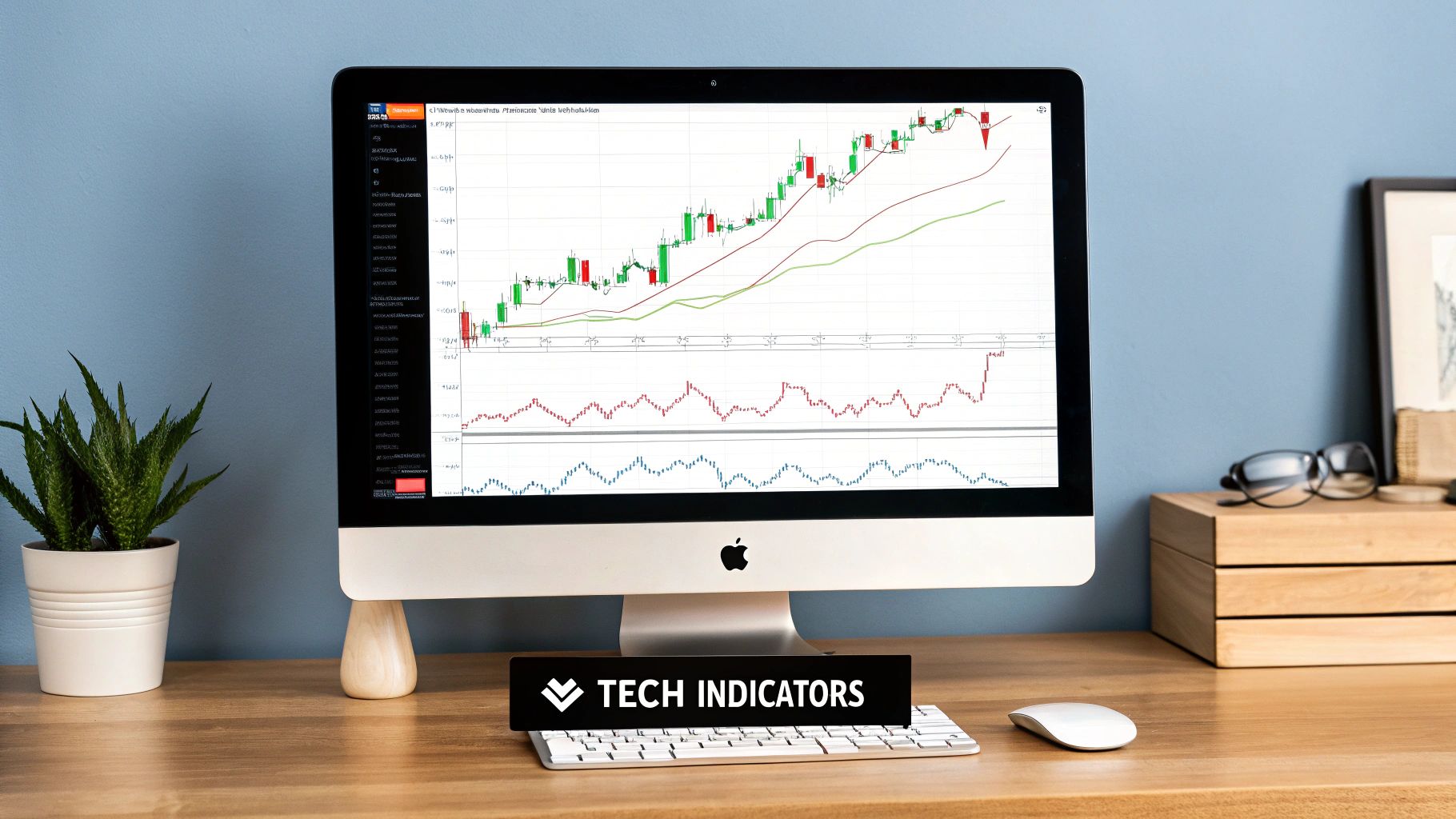
Using Indicators to Confirm Your Analysis
https://www.youtube.com/embed/sK-_6uIGMck
If candlestick patterns tell you the market's story, then technical indicators are your trusted fact-checkers. They bring an objective, data-driven layer to your analysis, helping you confirm what you think you see in the price action. This is crucial for avoiding trades based on gut feelings or random market noise.
The goal isn't to pile on indicators until your chart is unreadable. Instead, we're looking for confluence—that sweet spot where multiple, independent signs all point to the same conclusion.
This strategic layering is what separates guessing from educated trading. The global binary options broker market was valued at nearly $10 billion by 2023, which shows just how many people are jumping into these markets. You can read more about this explosive growth and its impact on broker market growth. That competition means you have to be sharp. Success here is all about predicting direction accurately, and the right indicators on a platform like OTC Charts MT4 give you a serious edge.
The Most Effective Indicators for Binary Options
While you could get lost in hundreds of available indicators, a few stand out as especially effective for the fast-paced world of binary options. I recommend mastering these key tools first. They give you a clear read on momentum, trend, and volatility without cluttering your screen.
Moving Averages (MA)
Think of a Moving Average as your trend filter. It smooths out the chaotic-looking price action so you can see the real underlying direction. For binary options, I lean on two main strategies:
- Trend Confirmation: Is the price staying consistently above a key MA, like the 50-period? If so, you have a confirmed uptrend. I often look for bounces off this MA as prime entry points for 'Call' options. The opposite is true for downtrends.
- Crossover Signals: A 'Golden Cross' happens when a faster MA (like the 20) crosses above a slower one (like the 50). This is a classic, powerful signal that bullish momentum is taking over. A 'Death Cross' (faster MA crossing below) is its bearish counterpart and warns of a potential slide.
Relative Strength Index (RSI)
The RSI is my go-to momentum oscillator. It’s a simple gauge, running from 0 to 100, that measures the speed and change of price movements.
Its main job is to flag overbought (usually above 70) and oversold (usually below 30) conditions. When an asset's RSI climbs above 70, it suggests the buying frenzy might be overdone, creating a potential 'Put' opportunity. On the flip side, a dip below 30 can signal that the selling is exhausted, setting up a nice 'Call' entry.
A Trader's Edge: RSI Divergence
The real magic of the RSI lies in divergence. If the price chart shows a new high, but the RSI indicator makes a lower high, that's bearish divergence. It's a massive red flag that the uptrend is running out of gas. Bullish divergence (lower price lows vs. higher RSI lows) signals the exact opposite. This is one of the most reliable reversal signals you'll ever find.
Bollinger Bands
Created by John Bollinger, these bands are fantastic for understanding volatility. They consist of a middle Moving Average line and two outer bands that represent standard deviations from that average.
When the bands squeeze together and get narrow, it tells you volatility is low—it’s often the quiet before a big move. When they suddenly expand, volatility is surging, and a strong trend is likely underway. The outer bands also act as dynamic levels of support and resistance; prices hitting the upper band often face rejection, while the lower band can provide a floor for bounces.
To help you keep these straight, here's a quick comparison of how I use these essential indicators in my day-to-day trading.
Common Technical Indicators for Binary Options
| Indicator | Primary Use | Key Signal to Watch |
|---|---|---|
| Moving Averages (MA) | Identifying and confirming the primary trend direction. | A "Golden Cross" (bullish) or "Death Cross" (bearish) for trend reversals. |
| Relative Strength Index (RSI) | Measuring momentum and spotting potential reversals. | Divergence—when the price and RSI move in opposite directions. |
| Bollinger Bands | Gauging market volatility and identifying dynamic support/resistance. | A "squeeze" (low volatility) followed by band expansion (breakout). |
By mastering these three, you build a solid foundation. You're not just looking at price; you're interpreting the market's underlying strength, momentum, and volatility. Remember, tracking which indicators work best for your strategy is a key part of improving your results. You can learn more by understanding essential trading performance metrics.
Putting It All Together: Real-World Trade Examples
Theory is great, but the real test is applying that knowledge to a live chart when your money is on the line. This is where we connect all the dots—price action, candlestick patterns, and indicator signals—to walk through how an experienced trader analyzes a setup. Let’s break down the thought process from start to finish using a platform like OTC Charts MT4.
These aren't just textbook examples; they’re the kind of opportunities that pop up daily. By seeing them dissected, you’ll start building a repeatable framework for your own trading.
A disciplined approach is everything. You need a consistent flow for analyzing any chart you pull up. This visual guide lays out the essential steps.
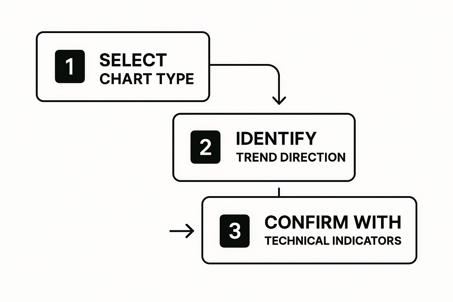
The key takeaway here is structure. You start broad (what's the overall trend?) and then zoom in on the specifics (what are the candles and indicators telling me?) before you even think about placing a trade.
Scenario 1: The Uptrend Continuation (Call Option)
Let's say you're watching the EUR/USD on a 5-minute timeframe. The first thing that should jump out at you is the market structure: a clear series of higher highs and higher lows. That's your uptrend. You also have a 50-period moving average plotted, and you notice the price is consistently bouncing off and staying above it, which reinforces your bullish bias.
Then, you see a pullback. The price dips down and kisses the 50 MA, a level that has proven to be solid dynamic support. Just as it touches, a big Bullish Engulfing candle forms. This is a classic, powerful signal. It’s the market screaming that buyers just stepped in with force right at a critical support zone.
Before pulling the trigger, you take a quick look at your RSI. It's hovering around 45, well below the overbought level of 70. Perfect. This tells you the move still has plenty of gas in the tank. With the uptrend, the candlestick signal, and the RSI all aligned, you have a high-probability setup for a 'Call' option.
Trader's Insight: The magic word here is confluence. We didn't act on a single signal. We patiently waited for the trend, a price action pattern, and an indicator to all point in the same direction. This layered analysis is what separates high-quality entries from gambling.
Scenario 2: Spotting a Reversal (Put Option)
Now for a different setup. You’ve been watching Gold rally hard for the last hour. But as it pushes to a new high, you spot a discrepancy on your chart. While the price just made a new peak, your RSI indicator didn't follow—it printed a lower high.
This is a textbook bearish divergence. It's a massive warning sign that the momentum driving the rally is drying up.
Your focus immediately shifts to the candles forming at this new high. A Shooting Star appears, with its small body and long, tell-tale upper wick. This pattern shows that buyers attempted to push higher but were slammed back down by sellers.
Let’s run through the checklist:
- Bearish Divergence on RSI: The underlying strength is fading.
- Shooting Star at Resistance: Price action confirms sellers are taking control.
- Market Context: The asset is overextended after a strong run, making it ripe for a correction.
With these pieces of evidence stacked up, you have a compelling reason to anticipate a reversal. This is an ideal spot to enter a 'Put' option, betting that the price will drop from this point of exhaustion.
As you can see, reading charts effectively is about assembling a puzzle, not hunting for a single magic indicator. It’s about building a story, piece by piece, until the market's next move becomes clear.
Even after you’ve spent some time staring at charts, a few questions tend to linger. I get asked these all the time, so let’s tackle them head-on. My goal here is to clear up those common sticking points so you can trade with more confidence.
This isn’t just a generic FAQ; it’s a rundown of the practical hurdles traders face every day. We'll bridge the gaps in your knowledge and get you from knowing how to analyze charts to truly understanding why you're doing it.
What’s the Best Timeframe for Binary Options?
This is the big one. And the honest answer? It all comes down to your trade’s expiration time. This is non-negotiable. If your chart timeframe doesn't match your expiration, you’re setting yourself up for failure. It's probably the single biggest reason I see traders lose.
Here's how I break it down from experience:
- For turbo trades (60 seconds to 5 minutes): Stick to a 1-minute chart. You need to see the micro-movements that matter for such a quick trade.
- For mid-range trades (15 to 30 minutes): A 5-minute chart is usually the sweet spot. It gives you a clear picture of recent momentum without all the noise of a 1-minute chart.
- For longer trades (1 hour or more): I’d pull up a 15-minute or even a 30-minute chart. This helps you see the bigger picture and trade with the dominant, underlying trend.
A Pro Tip: I always try to set my chart so I can see about 10 to 20 candles before my potential entry point. This gives me just enough recent history to make an informed decision without getting bogged down by old, irrelevant price data.
Why Are My Indicators Giving Me False Signals?
Let's get one thing straight: no indicator is a magic bullet. They all have weaknesses, and they usually fail when they're used in the wrong market environment.
The classic mistake is using a trend-following indicator, like a Moving Average, when the market is just bouncing around sideways. When there’s no clear trend, the price whipsaws back and forth, and your moving averages will cross repeatedly, screaming "buy" then "sell" in a confusing mess.
On the flip side, trying to use a momentum oscillator like the RSI in a powerful, runaway trend can be just as dangerous. The RSI can get stuck in the "overbought" zone and stay there for what feels like an eternity while the price just keeps pushing higher. If you jump on that "overbought" signal too early with a 'Put' option, you'll get run over.
The fix? First, learn to read the room. Is the market trending hard or just chopping sideways? Once you know that, you can pick the right tool for the job.
Should I Focus More on Indicators or Price Action?
Price action first, always. Think of the candlesticks as the raw story of the market. Indicators are just the footnotes. They are there for confirmation, not for generating the initial idea.
Here's how it plays out in real trading: the price is what's happening right now. An indicator is just a calculation based on what has already happened. That means it will always lag, even if just by a little.
So, trust what the candles are telling you at key levels. A big, bullish engulfing candle forming right on a major support line? That's a powerful signal by itself. Seeing your RSI poke up from oversold territory at the same time? That’s just the extra confirmation that gives you the confidence to pull the trigger.
Tired of guessing and ready to analyze the market with real precision? OTC Charts MT4 gives you the professional-grade charting and data you need to use these strategies effectively on platforms like Pocket Option.