
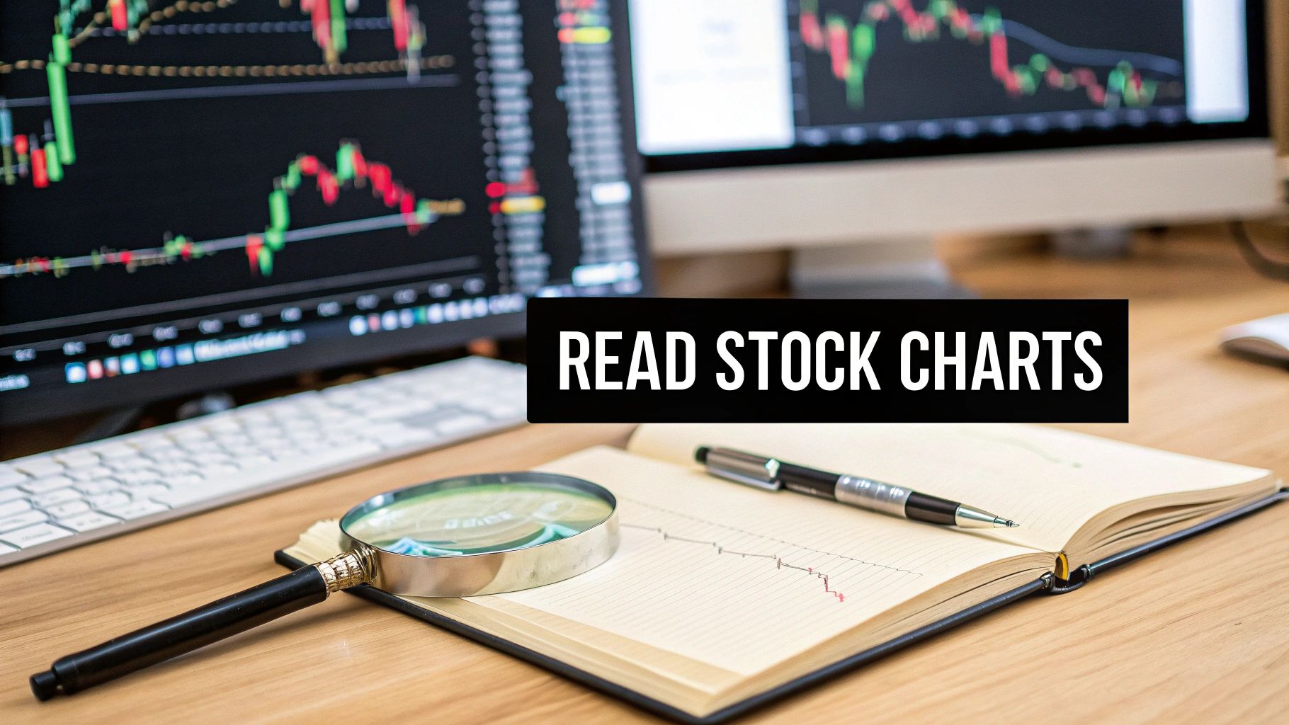
When you first pull up a stock chart, it can look like a foreign language—a chaotic mess of lines and colors. But it's not as complicated as it seems. At its heart, a chart is just a story about the constant tug-of-war between buyers and sellers, and learning to read it is the cornerstone of technical analysis.
Think of it as decoding market psychology. Every price move, big or small, is captured visually, giving you a powerful tool to inform your trading decisions.
Your First Look at a Stock Chart
Let's break down the basic anatomy. Every chart you'll ever see is built on two simple axes: the price is on the vertical (Y-axis), and time runs along the horizontal (X-axis). That's it. This grid plots the stock's price at specific moments in time, creating a visual history of its performance.
The real magic happens in how that price data is displayed. This is where different chart types come into play.
The Three Main Chart Types
While you’ll find plenty of exotic chart styles out there, virtually all trading and analysis is built on three fundamental types. Each one gives you a slightly different lens through which to view the market's action.
We can break these down easily.
Quick Guide to Common Chart Types
This table gives you a quick rundown of the big three. It’s a great reference for understanding which chart to use and when.
| Chart Type | What It Reveals | Ideal For |
|---|---|---|
| Line Chart | The "big picture" trend by connecting closing prices. | Getting a quick, clean overview of long-term price direction without intraday noise. |
| Bar Chart | The open, high, low, and close (OHLC) for each period. | A more detailed analysis of price range and volatility within a specific timeframe. |
| Candlestick Chart | The full OHLC data, visualized with a "body" and "wicks" that show buying vs. selling pressure. | Active trading and detailed pattern recognition; it’s the standard for most technical analysts. |
As you can see, each chart type builds on the last, adding more layers of information to your analysis.
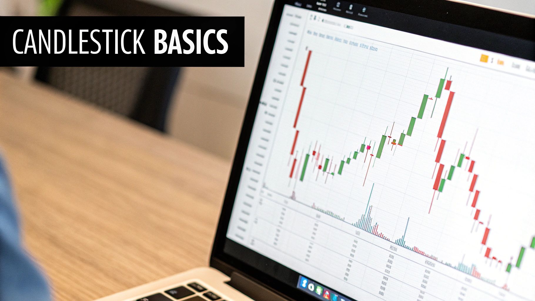
Most traders start with line charts but quickly graduate to candlesticks. The reason is simple: candlesticks tell a much richer story. They are the go-to choice for most active traders for a very good reason—they make interpreting price action incredibly intuitive.
Like a bar chart, a candlestick shows the open, high, low, and close prices. But it does so in a way that’s far easier to read at a glance.
Why Candlesticks Reign Supreme: The power of a candlestick chart is in its visual immediacy. The color and size of the "candle's" body instantly tell you about the market's sentiment for that session. This visual shortcut is why candlesticks are the bedrock of modern technical analysis.
For example, a long green candlestick screams that buyers were in complete control from the open to the close. On the flip side, a long red candle signals that sellers dominated. This instant feedback loop is what makes candlestick patterns so effective for making quick, informed trading decisions.
The Real Story Behind Candlestick Patterns
When you learn to read candlesticks, a chart stops being just a bunch of lines and starts telling a compelling story about market psychology. This is why active traders swear by them. Each candle is like a miniature drama, capturing the fierce tug-of-war between buyers (bulls) and sellers (bears) over a specific period.
Let's break down the anatomy. Every candlestick has two key parts: the body and the wicks (you’ll also hear them called shadows or tails). The thick body shows you the range between the opening and closing price. The thin wicks sticking out show the highest and lowest prices the asset hit during that same time.
The color of the body is your first and most important clue. By convention, a green (or white) candle means the price closed higher than it opened—a clear win for the buyers. A red (or black) candle tells you the opposite: the price closed lower than it opened, meaning sellers were in control.
Decoding the Narrative of a Single Candle
The real skill isn't just knowing what the parts are, but in understanding what they mean when you see them together. The interplay between the body and wicks is a powerful visual that gives you a much richer sense of market sentiment than a simple line or bar ever could.
Picture a long, solid green candle with almost no wicks. What does that tell you? It says that from the opening bell, buyers were in charge, aggressively pushing the price up and keeping it there right until the close. It's a snapshot of pure bullish strength.
On the flip side, a long red candle with tiny wicks paints the opposite picture. Sellers grabbed control right from the start and shoved the price down with barely any pushback from buyers. This screams bearish momentum. The size and shape of these candles are direct reflections of market conviction.
Key Takeaway: A candlestick isn't just data; it's a footprint of the market's behavior. A long body shows decisive action, while long wicks signal indecision and volatility, as the price explored extremes but couldn't hold them.
Key Beginner Patterns and Their Psychology
While there are hundreds of candlestick patterns out there, you don't need to know them all. Mastering a few foundational ones gives you a massive edge. These patterns aren't magic formulas; they're just recurring pictures of trader psychology. They show up time and again because human emotional responses to price—especially fear and greed—are remarkably predictable.
Let's walk through three critical patterns every trader should be able to spot instantly.
1. The Marubozu
A Marubozu is all body, no wicks. It's one of the most powerful and straightforward signals you can find.
- Green Marubozu: This means the open price was the low of the session, and the close was the high. Buyers dominated from start to finish. It’s an incredibly strong bullish signal.
- Red Marubozu: Here, the open was the session's high, and the close was its low. Sellers were in complete command, showing intense bearish pressure.
2. The Hammer
The Hammer has a short body at the top and a long lower wick that's usually at least twice the length of the body. You’ll often find it after a downtrend.
- Psychology: Think about what happened here. Sellers managed to push the price way down during the session. But before it closed, a surge of buying pressure came in and drove the price all the way back up to near its opening level. It's a sign that bulls are stepping in to defend that price, suggesting a potential bottom is forming.
3. The Doji
A Doji is all about indecision. It has a very small or even non-existent body, meaning the open and close prices were basically the same. It often looks like a plus sign or a cross.
- Psychology: This pattern represents a total stalemate. Neither the bulls nor the bears could gain the upper hand by the time the session ended. While a Doji on its own is neutral, seeing one appear after a strong trend can be a major warning sign that momentum is drying up and a reversal might be on the horizon.
Learning to spot these patterns is a great start, but understanding the story they tell is what helps you truly know how to read stock charts. To see how these visuals fit into the bigger picture of technical analysis, our guide on understanding trading charts can take you to the next level.
Using Timeframes to Understand Market Trends
The story a stock chart tells can change completely just by switching your viewing angle. What looks like a minor dip on a weekly chart might seem like a catastrophic crash on a 5-minute chart. This is the power of timeframes, and knowing which one to use is a fundamental part of reading charts effectively.
Your trading style really dictates which timeframe you should focus on. A long-term investor's chart is practically useless to a day trader, and vice-versa. Each timeframe essentially zooms in or out on the price action, revealing entirely different patterns, trends, and potential opportunities.
Matching Timeframes to Trading Styles
I like to think of timeframes as different map scales. The weekly chart is the globe, showing you entire continents of price movement. The 5-minute chart, on the other hand, is a detailed street map of a single neighborhood.
-
Day Traders: These folks are in and out of positions within a single day, trying to catch small, quick price moves. They live on short-term or intraday charts, like the 1-minute, 5-minute, or 15-minute views.
-
Swing Traders: Swing traders hold positions for a few days to a couple of weeks, aiming to capture one solid "swing" in the market. Their go-to charts are typically the 4-hour and daily charts, which help them spot multi-day patterns.
-
Position Traders and Investors: With a much longer horizon of months or even years, these participants care about the major, long-term direction of an asset. They use weekly and monthly charts to filter out all the daily noise and focus on the primary trend.
A classic rookie mistake is jumping onto a 15-minute chart without ever looking at the daily or weekly trend. You might think you're buying into a nice little uptrend, only to realize you're actually fighting a massive, powerful downtrend on the larger timeframe. Always start with the big picture and then zoom in.
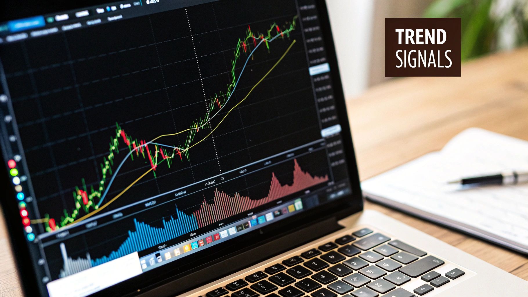
Identifying the Three Market Trends
No matter which timeframe you're looking at, a stock's price is only ever doing one of three things: going up, going down, or going sideways. Learning to spot the prevailing trend is the bedrock of technical analysis.
-
Uptrend: You'll see a clear series of higher highs and higher lows. This is a signal that buyers are firmly in control, pushing the price to new peaks and defending it at higher levels during pullbacks.
-
Downtrend: The exact opposite, a downtrend consists of a series of lower highs and lower lows. This tells you sellers are dominant, driving the price down and swatting away any attempts by buyers to regain control.
-
Consolidation (Sideways Trend): Here, the price bounces around in a relatively tight range, not making any real headway up or down. It's a period of equilibrium where buyers and sellers are in a stalemate, often coiling up for a big move.
Understanding these trends is so important because history often gives us clues. When you're reading a chart, you're really just analyzing patterns over time. For example, historical data on the Dow Jones Industrial Average (DJIA) shows plenty of wild years, with returns like +23.83% in 1976 followed by -6.98% in 1977. Analyzing these long-term swings helps traders get a feel for market behavior. You can dig into more of this kind of information on the data page from NYU's Stern School of Business.
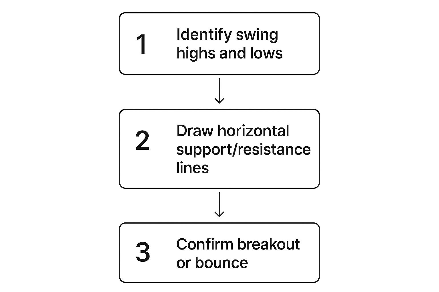
Drawing Trendlines to Find Support and Resistance
Once you can spot a trend, the next practical skill is drawing trendlines. These are just simple lines you draw on your chart to connect key price points, giving you a visual guide to the trend's path and potential turning points.
Drawing them is pretty straightforward:
- For an Uptrend: Find at least two major swing lows and connect them with a line. This line now acts as your support level—a floor where buyers have historically stepped in to stop the price from falling.
- For a Downtrend: Find at least two major swing highs and connect them. This line becomes your resistance level—a price ceiling where sellers have consistently shown up to overwhelm buyers.
These lines aren't just random. They represent areas of market memory, where the battle between bulls and bears has pivoted before. As long as the price respects that trendline, the trend is still in play. But a decisive break through a trendline is often one of the first signs that the trend is weakening and might be about to reverse. Getting this simple technique down is a huge step forward in your ability to read charts.
Adding Technical Indicators to Your Toolkit
Alright, you've got a handle on candlesticks and basic trend lines. Now it's time to layer in some tools that bring more precision to your chart reading. This is where technical indicators come into play.
Don't let the name intimidate you. They're just mathematical calculations based on a stock's price and volume, plotted right onto your chart. Think of them as specialized instruments. While price action gives you the broad strokes, indicators help you measure things like trend strength, momentum, and potential exhaustion points. They add a layer of objectivity to what can sometimes feel like a subjective art.
There are hundreds of indicators out there, and it's easy to get lost. We're going to focus on three of the most reliable and widely used tools in any trader's arsenal. If you can master these, you'll have a fantastic foundation for building a solid trading strategy.
Seeing the Bigger Trend with Moving Averages
The Moving Average (MA) is probably the first indicator every trader learns, and for good reason. It smooths out the chaotic day-to-day price fluctuations into a single, flowing line. This immediately makes it easier to see the true underlying trend without getting faked out by random noise.
You'll mainly encounter two types: the Simple Moving Average (SMA) and the Exponential Moving Average (EMA). The only real difference is that the EMA places more importance on recent price action, so it reacts a bit faster.
When you're just learning to read charts, two moving averages are absolutely essential:
- The 50-Day Moving Average: I think of this as the gatekeeper of the intermediate trend. If the price is consistently staying above its 50-day MA, you're looking at a healthy uptrend. If it's struggling to get above it or trading below, the intermediate trend is likely down.
- The 200-Day Moving Average: This one is the undisputed king of long-term trend analysis. It shows the average price over roughly 40 weeks of trading. A stock above its 200-day MA is in a long-term bull market; below it, it's in a bear market. It’s that simple.
Trader's Insight: Watch for the "Golden Cross" and "Death Cross." These are powerful signals that happen when these two MAs interact. A Golden Cross is when the shorter-term 50-day MA crosses above the 200-day MA, often kicking off a new major uptrend. The opposite, a Death Cross, is when the 50-day falls below the 200-day, warning of a potential long-term downtrend.
Measuring Momentum with the MACD
Okay, so you can see the trend. But how strong is it? Is it gaining steam or running out of gas? That’s what the Moving Average Convergence Divergence (MACD) is built for. It’s designed specifically to measure the momentum and strength behind a price move.
The MACD has two lines and a histogram: the MACD line, the signal line, and the histogram bars that show the distance between the two.
The most common signal is a crossover. When the MACD line crosses above the signal line, it’s a bullish sign that momentum is shifting to the upside. When it crosses below, it’s a bearish warning. The histogram gives you a great visual shortcut: bars above the zero line mean bullish momentum is in charge; bars below mean bearish momentum has taken over.
Gauging Overbought and Oversold Conditions with RSI
The last core tool we'll cover is the Relative Strength Index (RSI). This is a momentum oscillator that moves between 0 and 100, measuring the speed and magnitude of price changes. Its classic use is to spot overbought and oversold levels.
Here’s the traditional take:
| RSI Reading | Market Condition | What It Suggests |
|---|---|---|
| Above 70 | Overbought | The stock might be getting ahead of itself and could be due for a pullback. |
| Below 30 | Oversold | The stock may have been sold off too hard and could be ready for a bounce. |
But here’s a critical piece of advice: a stock in a powerful uptrend can stay "overbought" for a very long time. Just selling because the RSI is above 70 is a classic rookie mistake. The real magic of the RSI often lies in spotting divergence. This happens when the price grinds to a new high, but the RSI makes a lower high. That's a huge red flag that the momentum is fading, and a reversal could be around the corner.
Using these indicators together gives you a much richer view of the market than any single one can. Of course, the only way to trust your signals is to test them. To see how pros validate their systems, take a look at our guide on how to backtest trading strategies. It's a crucial step before you put any real money on the line.
A Real-World Stock Chart Analysis Walkthrough
Alright, theory is one thing, but the real learning happens when you put it all together on an actual chart. This is where you move from just looking at a chart to truly understanding its story.
Let's walk through an analysis of a fictional tech company, "Innovate Corp" (ticker: INVT). I'll show you how I'd approach this using a top-down method, layering on different pieces of evidence to build a solid trading idea.
Starting With the Big Picture
First things first, I always zoom out to the weekly chart. Why? Because it tells me the primary, long-term trend. Getting this right from the start helps me avoid the classic mistake of fighting the market's main current.
Looking at INVT's weekly chart, I can see a clear pattern: a series of higher highs and higher lows that has been in place for over a year. The price is also trading comfortably above its 200-day moving average.
This tells me something crucial: the path of least resistance is up. Buyers are in control, so my focus should be on finding smart entry points for long positions, not trying to guess the top.
Identifying Key Battlegrounds
Now I'll zoom into the daily chart. This is where I start pinpointing the more immediate and actionable price levels. I'm looking for the market's memory—those horizontal lines of support and resistance where price has reversed in the past. These are the battlegrounds.
I can spot a very strong resistance level at $150. INVT has tried and failed to break through this price on three separate occasions in the last six months. I also see a major support zone around $135, a price where buyers have consistently shown up to defend the stock.
Mapping out these swing points gives you a roadmap for where price is most likely to react. It’s either going to bounce or break.
Reading the Recent Price Action
With my key levels marked, it’s time to get granular and look at the most recent candlesticks. This is how you gauge the current sentiment.
INVT has just pulled back to that $135 support level I identified. And look at yesterday's candle—it's a perfect Hammer pattern, with a tiny body and a long lower wick.
Trader's Insight: The psychology behind a Hammer at support is incredibly powerful. It tells you that sellers tried to force the price lower, but a huge wave of buying pressure came in right at $135 and drove the price all the way back up by the close. It’s a clear signal that the support level is holding firm.
This single observation is the core of my short-term bullish thesis. I have a long-term uptrend, the price is sitting on known support, and a bullish candlestick pattern just printed. The pieces are falling into place.
Using Indicators for Confirmation
The last piece of the puzzle is to check my indicators. I use these for confirmation, not for generating the initial idea. They should support what the price action is already telling me.
-
Relative Strength Index (RSI): A quick look at the daily RSI shows it's at 28. Anything below the 30 threshold suggests the stock is in oversold territory. This fits perfectly with the idea that the recent pullback is running out of steam and a bounce is likely.
-
MACD: The MACD lines are below the zero line and still drifting apart, which reflects the recent bearish momentum. But here's the key: they are starting to flatten out. This hints that the downward push is losing its power. I'd now be watching for a bullish crossover in the coming days as a final confirmation.
By combining the big-picture trend, key support/resistance levels, candlestick patterns, and confirming indicators, we've built a complete analysis. This multi-layered approach gives me far more confidence than relying on any single signal in isolation.
To really get good at this, keeping detailed records is a game-changer. I highly recommend checking out some trading journal examples to get a framework for tracking your analyses and learning from every trade, win or lose.
Common Questions About Reading Stock Charts
As you start piecing together everything you’ve learned, you're bound to have questions. That's not just normal; it's a sign you're digging in and really learning the ropes. Let's tackle some of the most common hurdles new traders face. Getting these straight will build your confidence and help you sidestep some easy-to-make mistakes.
What's the "Best" Timeframe to Use?
One of the first things everyone wants to know is which timeframe is the best. The honest answer? There isn't one. It all comes down to your personal trading style and what you're trying to accomplish.
For instance, a day trader looking to scalp small, quick profits might live on the 1-minute or 5-minute charts. Their entire world is the intraday ebb and flow. On the other hand, a long-term investor analyzing a company's potential over several years will find the weekly and monthly charts far more valuable. Those higher timeframes smooth out the daily "noise" and show the bigger picture.
Key Takeaway: The golden rule is simple: match your chart's timeframe to your investment horizon. A mismatch here is one of the most common—and costly—rookie mistakes.
How Reliable Are Technical Indicators?
Another big question is how much faith to put in technical indicators like the RSI or MACD. It’s absolutely critical to see them for what they are: tools for confirmation, not crystal balls. They don't predict the future. Instead, they provide supporting evidence for what the price action and trend are already telling you.
Leaning on a single indicator for your buy and sell signals is a classic beginner's trap. A much stronger approach involves layering several non-correlated indicators. Think of it like building a case for a trade.
You might use:
- Moving averages to confirm the overall trend direction.
- The RSI to gauge if a pullback is getting overextended and ripe for a reversal.
- A specific candlestick pattern to pinpoint your exact entry.
When all three align, you have a much more robust reason to pull the trigger.
Do I Need a Finance Degree to Read Charts?
A lot of people are intimidated, thinking they need a degree in finance to make sense of charts. The short answer is a resounding no. You can absolutely learn to read patterns, trends, and indicators as a purely visual skill without ever dissecting a balance sheet.
That said, having a basic understanding of market fundamentals gives you invaluable context. Knowing what a company actually does or why a big economic report might rattle its stock adds the "why" to the "when" your charts provide. The most well-rounded traders I know have found a sweet spot by blending the two disciplines—using technical analysis to time their moves within a broader fundamental framework.
Elevate your trading with professional-grade tools designed for precision. OTC Charts MT4 provides instantaneous and accurate OTC quotes directly into MetaTrader 4, helping you anticipate market movements with confidence. Get the competitive edge you need today.