
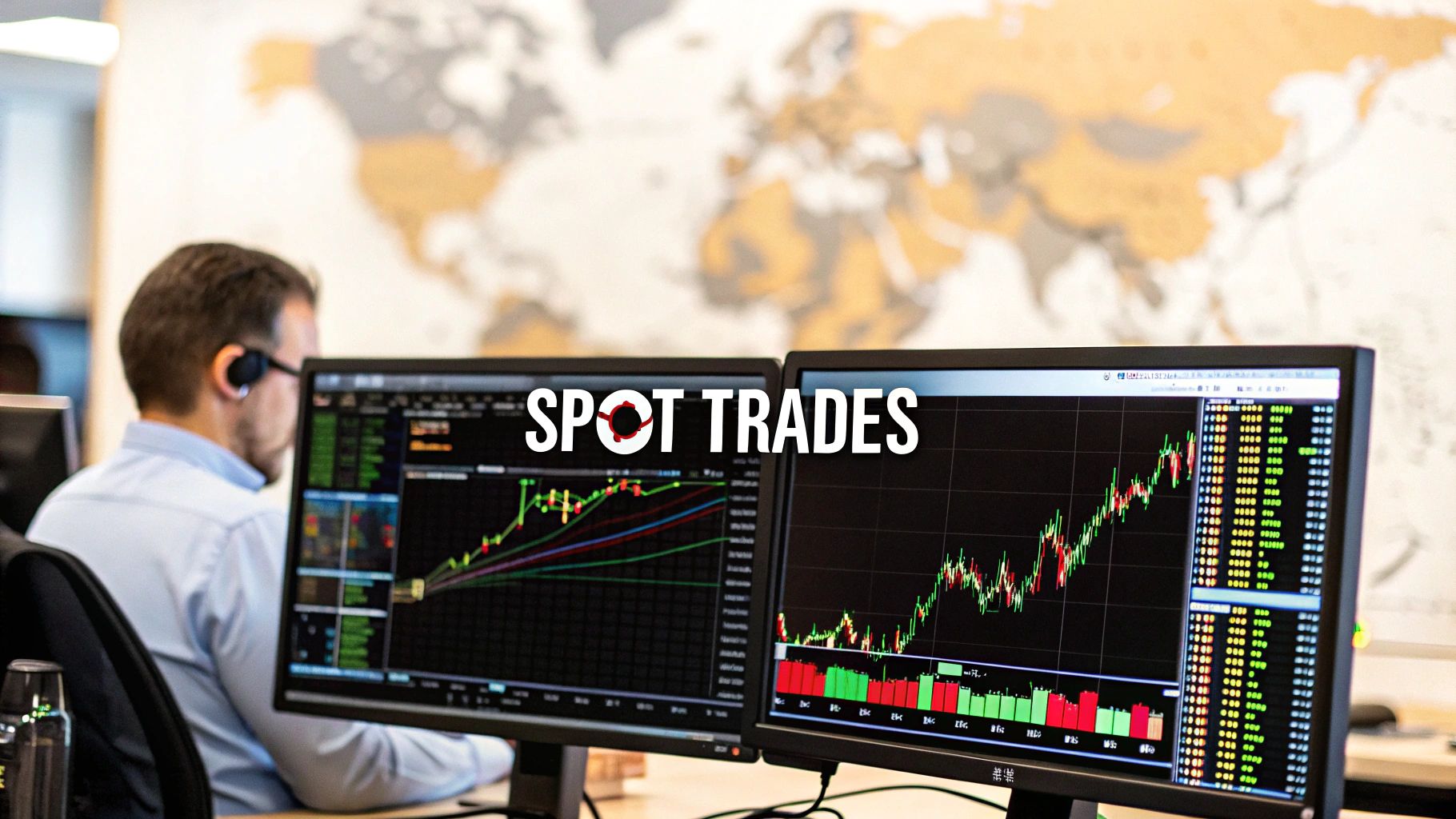
Finding consistent trading opportunities isn't about some secret indicator or a "holy grail" system. It really comes down to a disciplined, repeatable process. The best traders I know have mastered blending a few key skills: reading chart patterns, understanding what's actually driving the market, and, of course, having a rock-solid plan for managing risk.
Building Your Foundation for Spotting Trades
The journey to finding high-probability setups is paved with a clear understanding of three core analytical pillars. I like to think of them as different lenses for viewing the market. Each one gives you a unique perspective, but when you learn to use them together, the picture becomes so much clearer. That clarity is what gives you the confidence to act.
This guide will serve as your roadmap. We're going to start by laying down the core concepts—the "why" behind the "how"—so you can graduate from just following signals to genuinely understanding what makes the market tick.
The Three Pillars of Market Analysis
A solid trading framework needs to pull insights from all three of these methods. If you rely on just one, you're flying with a huge blind spot, vulnerable to market forces you never saw coming.
Let's break them down.
-
Technical Analysis: At its heart, this is the art and science of studying price charts. You're looking at past price action and volume to forecast where prices might go next. The core belief here is that all known information—news, sentiment, everything—is already baked into the price you see on the screen.
-
Fundamental Analysis: This is the "big picture" approach. Instead of just looking at charts, you're digging into the economic and financial factors that give an asset its real-world, intrinsic value. Think interest rates, economic reports, a company's earnings, or geopolitical events.
-
Sentiment Analysis: This one is all about gauging the overall mood of the market. Are traders feeling optimistic (bullish) or pessimistic (bearish)? This "crowd psychology" is a powerful, though sometimes tricky, force that can push prices around in ways that fundamentals or technicals alone can't explain.
A huge mistake I see beginners make is treating these as an "either/or" choice. The real magic happens when you synthesize them. A perfect technical setup becomes exponentially more powerful when it's backed by strong fundamental news and a wave of bullish sentiment.
Before we dive deeper, here’s a quick summary of how these approaches fit together.
Core Analytical Approaches for Traders
This table outlines the three main ways traders analyze the market. Understanding each one is the first step toward building a comprehensive strategy.
| Analysis Type | Primary Focus | Key Tools & Indicators |
|---|---|---|
| Technical | Price action, chart patterns, and historical data | Moving Averages, RSI, MACD, Support/Resistance, Trendlines |
| Fundamental | Intrinsic value, economic health, and financial data | Economic reports (GDP, CPI), earnings statements, interest rates |
| Sentiment | Market mood and crowd psychology | CBOE Volatility Index (VIX), Put/Call Ratios, News headlines, Social media trends |
Mastering the blend of these perspectives is what transforms your process from educated guesswork into a structured, repeatable framework. Developing a strategy that combines them is your top priority. In fact, you can learn a lot more by checking out this guide on building a simple trading system, which is all about integrating these foundational ideas into something you can actually use.
Reading the Story of Price Action and Chart Patterns
Price charts aren't just lines and numbers; they're a living, breathing story of market psychology. Every single candlestick, every wick, and every pattern is a footprint left behind by the constant tug-of-war between buyers and sellers. If you want to spot high-quality trades before the rest of the market piles in, you have to learn how to read that story.
It’s about more than just memorizing shapes. You need to understand the why behind the pattern. A Head and Shoulders pattern, for instance, isn't just a random three-peak formation. It’s the visual evidence of buyers making one last, desperate push higher, failing, and then losing control to the sellers. That’s a powerful narrative.
This is what it looks like when a trader pieces together all the different clues from the market to form a solid analysis.
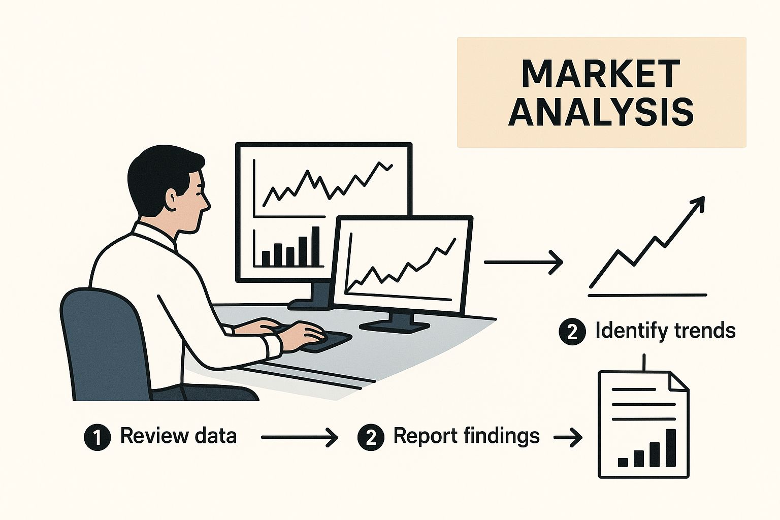
As the image shows, finding a good trade is a process of deep analysis, not just a single discovery. This is exactly the kind of story you should be looking for every time you open a chart.
Interpreting Common Continuation and Reversal Patterns
First things first, you need to know whether a pattern is telling you the current trend is likely to continue or reverse. Getting this right is fundamental. It’s how you make sure you’re trading with the market’s momentum, not against it.
Continuation Patterns: These pop up when the market is just taking a breather before continuing its original move.
- Flags and Pennants: You'll see these after a big, sharp move. They look like little sideways rectangles (flags) or triangles (pennants) where the market consolidates for a bit. It’s often just traders taking a little profit before the next leg up or down.
- Ascending/Descending Triangles: These are classic continuation signals. An ascending triangle in a strong uptrend, for example, shows buyers are getting more aggressive, stepping in at higher and higher lows. This builds pressure that often leads to a breakout to the upside.
Reversal Patterns: These are your warning signs. They signal that a trend is running out of gas and might be about to flip.
- Head and Shoulders: This is a classic for a reason. It’s a very reliable pattern that can signal a top is in and a downtrend is about to begin. That "head" represents the final, exhausted gasp from the buyers.
- Double Tops/Bottoms: Think of these as "M" or "W" shapes on your chart. They show two failed attempts to break a major support or resistance level, and a reversal often follows.
A textbook pattern in a vacuum means nothing. Context is everything. A Bull Flag is a much more powerful signal if it forms right after the price has broken through a major resistance level, especially if you see volume kick in.
From Pattern to Plan on OTC Charts MT4
Spotting a pattern is great, but it’s only the first step. The real skill is turning that observation into a concrete trading plan with clear rules. This is where a platform like OTC Charts MT4 shines, because it lets you mark up your charts precisely and execute your plan right there.
Let’s walk through a real-world scenario. You're looking at the EUR/USD OTC chart and you spot a descending triangle forming within a clear downtrend.
Here's how you can turn that pattern into a trade:
- Define Your Entry: Don't just jump in because the pattern looks right. A disciplined entry is on the close of the candle that breaks decisively below the triangle's flat support line. Waiting for that confirmation helps you sidestep frustrating fakeouts.
- Set Your Stop-Loss: The logical spot for your stop-loss is just above the triangle’s descending trendline. If the price moves back up there, your trade idea is invalidated, and you get out with a small, manageable loss.
- Establish a Profit Target: A simple and effective way to set a target is to measure the widest part of the triangle (from its first high down to the support level). Then, project that same distance down from your breakout point. This gives you a data-backed target to aim for.
This structured process takes a simple chart pattern and turns it into a professional trade with a defined risk-to-reward ratio. If you're looking to build a stronger base in these core skills, our guide on technical analysis for beginners is an excellent place to start.
Using Indicators to Confirm Your Trading Ideas
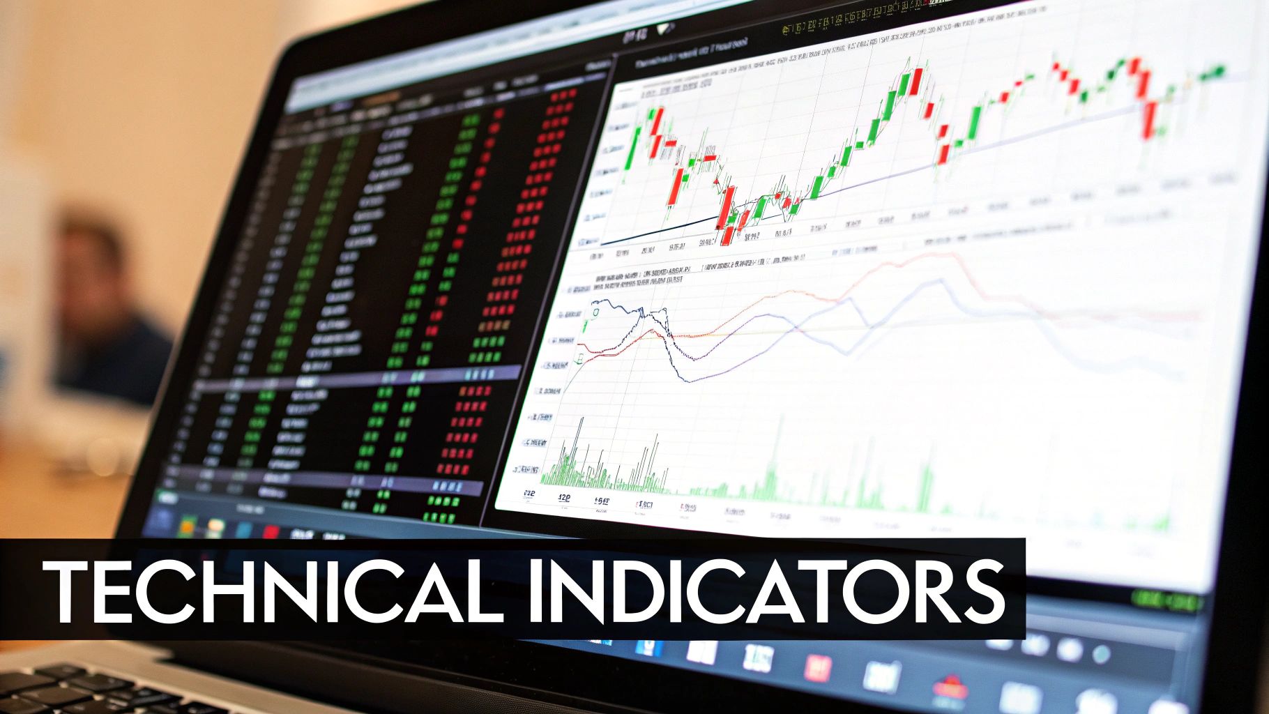
Think of technical indicators as a second opinion. They aren’t the reason you take a trade, but they are fantastic for confirming what the price action and chart patterns are already suggesting. One of the biggest mistakes I see traders make is piling dozens of indicators onto their charts. This just creates a mess of conflicting signals and leads to a classic case of analysis paralysis.
A much cleaner, more effective approach is to layer just a couple of non-correlated indicators to build confluence. That’s just a fancy way of saying you have multiple, independent signals all pointing to the same conclusion. When that happens, your confidence in the trade idea skyrockets.
Building Confluence with Moving Averages and RSI
A powerful, time-tested combination is pairing a trend-following tool with a momentum oscillator. Let's look at two of the most popular: Moving Averages (MAs) and the Relative Strength Index (RSI).
- Moving Averages cut through the noise of daily price swings to give you a clearer picture of the underlying trend.
- The RSI acts like a speedometer for the market, measuring how quickly prices are changing to help you spot overbought or oversold conditions.
Let's walk through a real-world scenario. Say you've spotted a nice bull flag pattern forming on an asset that's clearly in an uptrend. Before you rush to place an order, you can use these indicators to check your work. Is the price staying firmly above a key moving average, like the 50-period EMA? And what's the RSI doing? Is it showing strength by bouncing up from the 40 or 50 level, rather than being dangerously overbought up past 70?
When the pattern, the trend, and the momentum all line up, you’ve likely found a high-probability setup. This kind of disciplined layering is how you spot trading opportunities that are actually robust and reliable.
Your goal isn't to find an indicator that's "right" all the time—that doesn't exist. The goal is to build a system where your chart pattern tells you what might happen, and your indicators help confirm if it's a good time to act.
Uncovering Hidden Clues with Divergence
Sometimes, the most powerful signals are the most subtle. One of the best examples of this is divergence. It happens when the price of an asset is moving in the opposite direction of a technical indicator, like the RSI or MACD. This is often a huge warning sign that the current trend is running out of gas.
Bullish Divergence
- What it is: The price chart shows a new lower low, but your indicator (RSI or MACD) prints a higher low.
- What it means: Selling momentum is drying up. Even though price fell, the force behind the drop was weaker. This often happens right before a trend reverses to the upside.
Bearish Divergence
- What it is: The price pushes to a new higher high, but the indicator shows a lower high.
- What it means: The buying pressure is fading. The bulls are getting tired, and a reversal to the downside could be just around the corner.
For instance, if a stock rips to a new high but the RSI can't even match its previous peak, that’s a major red flag for me. It’s a signal that the conviction behind the move is weak. That makes it a terrible time to chase the trend and a great time to start looking for a potential short entry.
Divergences are powerful because they give you a peek into the market’s underlying strength before it becomes obvious on the price chart. On a platform like OTC Charts MT4, you can easily overlay these indicators to spot these subtle yet crucial signals for yourself.
Adding Conviction with Volume and Market Data
Think of it this way: price action and chart patterns tell you what happened, but volume reveals the conviction behind the move. It's the difference between a whisper and a shout in the marketplace.
A breakout on weak, anemic volume is always suspect. It’s a red flag. But a breakout that explodes on a massive volume spike? That’s a move that demands your full attention. This is how you stop just guessing at chart patterns and start truly confirming them.
You don't need a dozen new indicators cluttering your screen. This is about learning to read the market’s enthusiasm, or lack thereof. When you see a price smash through a key resistance level, your eyes should immediately flick down to the volume bars. A huge increase tells you a flood of buyers is entering the fray, validating the move and massively increasing the odds that it has legs.
This simple cross-reference is one of the most powerful habits you can build to find trades with real momentum.
A classic mistake I see traders make is getting spooked by low volume during a consolidation. In a flag or pennant pattern, low, quiet volume is actually a good sign. It suggests the sellers have run out of steam and the market is just catching its breath before the next push higher.
Looking Beyond the Current Session
While what's happening right now is vital, pulling back to look at historical data can give you a serious strategic advantage. Understanding the market's broader rhythm helps you spot periods of high liquidity, which often precede major price swings.
For example, looking at historical market volume from US equities exchanges—data that goes all the way back to 2009—can reveal powerful trends. Metrics like total shares traded, notional value, and daily trade counts show you when the entire market is heating up. This signals a more volatile environment that’s often rich with opportunity. You can explore this information yourself and find more data about historical market volume on Cboe.com.
This macro perspective helps you put the volume on your chart into context. Is that volume spike on your stock an isolated event, or is it part of a much bigger, market-wide shift? Knowing the answer adds a data-driven edge that most retail traders completely ignore.
Using On-Balance Volume for Confirmation
For a more dynamic way to track volume flow, the On-Balance Volume (OBV) indicator is one of my go-to tools. It’s essentially a running tally of volume, adding volume on up days and subtracting it on down days. I think of it as a simple way to see where the "smart money" might be flowing before it's obvious in the price.
Here are a couple of practical ways to use it:
- Confirming a Trend: In a healthy uptrend, you want to see both price and OBV making higher highs. If price pushes to a new high but the OBV fails to follow, that’s a bearish divergence. It's a warning sign that the trend might be losing its underlying strength.
- Spotting Breakouts Early: This is a powerful one. Sometimes, the OBV will break out from a consolidation range before the price does. This is a fantastic leading signal that pressure is building under the surface and a price move is probably imminent.
Adding volume analysis to your routine is a game-changer. It’s a non-negotiable step toward filtering out weak, low-probability setups and focusing only on the ones with real institutional backing.
Of course, even the best A+ setup can fail without proper risk controls. To make sure you’re protecting your capital, I highly recommend reading our guide on trading risk management techniques.
Weaving in Global Trends and Fundamental Catalysts

Technical analysis is your microscope for examining price action. That's essential. But fundamental analysis? That's your map of the entire world. If you're trading without at least a basic grasp of the fundamental picture, you're essentially sailing in a storm without a compass. Your technique might be flawless, but a massive external wave can easily capsize your trade.
The goal here isn't to turn you into a PhD economist. It's about being smart enough to align your technical setups with major economic news and global trends. This simple step helps ensure you’re trading with the market’s primary current, not fighting against it. A clean technical signal becomes exponentially more powerful when it's backed by a strong fundamental reason.
Pinpointing News That Actually Moves the Needle
First things first, you need to know which news events are worth your time. The economic calendar is packed with data releases every single day, but honestly, only a select few have the real punch to spark serious volatility and create clear trading opportunities.
You’ll want to keep a close eye on these high-impact announcements:
- Interest Rate Decisions: These are the big ones. Announcements from central banks like the U.S. Federal Reserve or the European Central Bank can dramatically shift currency values almost instantly.
- Inflation Reports (CPI, PPI): The Consumer Price Index (CPI) and Producer Price Index (PPI) are the market's primary inflation gauges. If inflation comes in hotter than expected, it often signals that a central bank might have to raise rates, which sends ripples across all markets.
- Employment Data: Reports like the U.S. Non-Farm Payrolls (NFP) are a vital health check for an economy. Strong job numbers can signal economic strength and give a currency a significant boost.
I’ve learned from experience that the best trades often come not from the news itself, but from the market's reaction to the news. A currency might initially spike on a positive report, only to reverse as traders “sell the news.” Watching the price action in the moments after a release is crucial.
Aligning Your Trades with the Bigger Picture
Looking beyond the daily news cycle, you need to have a sense of the long-term global trends. This gives you a directional bias. For instance, knowing which economies are booming and which are struggling helps you instinctively favor long or short positions in their currencies or stock indices.
Take the steady growth of global trade as a prime example of a macro trend. Over the last century, world exports have exploded, growing more than 40 times larger in constant prices. The share of global exports relative to GDP has shot up from under 10% to around 25%. This just goes to show how deeply interconnected markets are, and it’s why a major event in China can create massive opportunities in the U.S. or Europe. You can really dive into this powerful trend by exploring the history of trade and globalization on Our World in Data.
When you combine a strong technical signal—say, a clean breakout pattern—with a fundamental backdrop that supports the move, like a surprisingly positive economic report for that country, you are systematically stacking the odds in your favor. This integrated approach is what separates amateurs from professionals. It elevates your trading from just reacting to squiggles on a chart to anticipating major market moves because you see the whole picture.
Alright, let's move beyond the basics of technical analysis. If you really want to gain an edge, you need to start thinking like the big institutional players. They often use a more quantitative approach, looking at market-based probabilities pulled directly from the options market.
This gives you a powerful, almost behind-the-scenes look at market sentiment. It helps you anticipate major price swings before they're obvious to everyone else staring at the same charts.
When you learn to read what the options market is implying, you add a sophisticated, data-backed layer to your trading strategy. It’s like having a cheat sheet that shows you when the market might be mispricing risk, especially around huge events like earnings reports or Fed announcements. This is how you find those high-conviction trades—the ones with a much better risk-to-reward profile that most retail traders completely miss.
Think of it this way: the collective wisdom (and, more importantly, the money) in the options market leaves clues about future volatility. If options premiums on a stock suddenly get super expensive, it’s a massive signal that traders are betting on a big move. You can't afford to ignore that.
So, What Are Implied Probabilities?
Don't worry, this isn't about getting bogged down in complex financial math. It's really about interpreting one crucial piece of data. The price of an option inherently reflects the market's collective bet on the probability of an asset hitting a certain price by a certain date.
This data-driven method for spotting trades isn't just theory; it's backed by serious research. The Federal Reserve Bank of Minneapolis, for instance, created models to pull these probabilities right from option prices, giving them a real-time gauge of where an asset might go.
This means you can see, in clear numbers, the market-implied probability of a 20% surge in the S&P 500 or a 20% plunge in the EUR/USD. These aren't just guesses; they represent the market's consensus. Armed with that, you can better judge if the current price is a bargain or a trap. If you want to go deeper down this rabbit hole, you can explore more about these market probability findings from the source.
So, how do you actually put this to work?
- Before Big News: Got a major economic report coming up? Check the implied volatility. If it has spiked, the market is bracing for a shockwave. That’s your cue that a trading opportunity is right around the corner.
- Spotting Complacency: What if your charts are screaming that a breakout is building, but implied volatility is strangely low? That’s a classic contrarian signal. It suggests the market has fallen asleep at the wheel, creating the perfect setup for a surprise move you can capitalize on.
Once you start integrating these market-based probabilities, your entire perspective shifts. You begin thinking in terms of quantified risk and reward, just like a professional. It’s an objective, powerful tool to add to your arsenal.
Common Questions About Finding Trading Opportunities
Even with a solid strategy in place, questions inevitably come up. Let's walk through some of the most common hurdles I see traders encounter when they're learning to spot opportunities, and I'll give you some straightforward answers to sharpen your approach.
How Long Should I Wait for Confirmation?
This is a classic for a reason. There isn't a magic number, but a fantastic rule of thumb is to wait for a candle to close beyond a key level. If you're looking to go long, you want to see a full candle close above a resistance line. For a short, you need that close below support.
Sticking to this simple rule is one of the best ways to filter out those infuriating "fakeouts"—where the price stabs through a level for a moment, only to snap right back.
For even stronger confirmation, I always look for a corresponding volume spike. A breakout on high volume shows conviction, while a low-volume move is often a trap.
Can I Succeed with Only Technicals?
While some traders do manage to trade purely off the charts, I've found that integrating fundamentals gives you a massive edge. It provides crucial context. Think about it: a perfect chart pattern becomes infinitely more reliable when it lines up with the broader economic story.
Ignoring major news events, like a central bank's interest rate decision, is a recipe for disaster. You can have an A+ technical setup, but a surprise announcement can blow it out of the water in seconds.
What Is the Biggest New Trader Mistake?
Hands down, the most common pitfall I see is analysis paralysis. New traders get excited and plaster their charts with a dozen different indicators. What they end up with is a chaotic mess of conflicting signals that leads to hesitation and missed trades.
My advice? Start with a clean chart. Focus on price action first—the raw story of supply and demand. Then, add just one or two indicators that you understand inside and out. Use them to confirm what price is already telling you, not to generate the idea in the first place.
Ready to stop reacting and start anticipating market moves? OTC Charts MT4 gives you the professional-grade, real-time data you need to apply these strategies with precision. Elevate your Pocket Option trading today.