
At its core, understanding a candlestick chart comes down to a simple, powerful idea: every single candle tells the story of a battle between buyers and sellers within a specific timeframe. A green candle means the buyers won that round, pushing the price up. A red one means the sellers took control and drove the price down. Once you learn to read these individual skirmishes, you can start to see the bigger picture of the market's war.
Decoding the Language of the Market
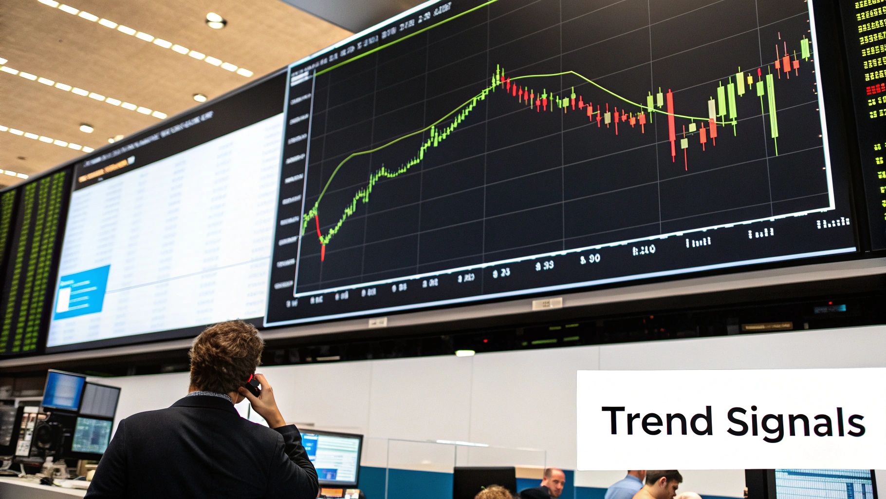
Trying to trade without understanding candlesticks is like trying to read a book in a foreign language. You see the characters on the page, but the story—the real meaning—is completely lost on you. Candlestick charts are the native language of the financial markets, and each candle is a word loaded with critical information. Mastering this language is your first real step from being a spectator to becoming a trader who can act with conviction.
Unlike a basic line chart that just connects the dots of closing prices, a candlestick chart gives you a much richer view. It’s a dense, visual shortcut to understanding price action and, just as importantly, market sentiment. Each candle captures four key pieces of data for its time period: the open, high, low, and close. You can get a deeper dive into these data points in our complete guide on how to read stock charts.
To really grasp the power of a single candle, let's break down its parts. Think of this table as your decoder ring for price action.
Decoding a Single Candlestick
| Component | What It Represents | Market Implication |
|---|---|---|
| Real Body | The range between the open and close price. | A long body shows strong momentum (buying or selling). A short body suggests indecision or weak momentum. |
| Color | The direction of the price move. | Green (or white) means the price closed higher than it opened (bullish). Red (or black) means it closed lower (bearish). |
| Upper Wick | The highest price reached during the period. | A long upper wick indicates that buyers tried to push the price up but sellers forced it back down, showing selling pressure. |
| Lower Wick | The lowest price reached during the period. | A long lower wick shows that sellers tried to push the price down but buyers stepped in, signaling buying pressure. |
Essentially, the body tells you who won the fight, and the wicks show you how messy that fight was.
The Four Pillars of a Candlestick
Every candle you see is built from four fundamental price points. Getting these straight is non-negotiable if you want to understand what the market is doing.
- Open: The price where trading began for that period.
- High: The absolute peak the price hit during that time.
- Low: The absolute bottom the price touched.
- Close: The final price when the period ended.
These four points are the DNA of every candlestick. The relationship between the open and the close is what gives the candle its color and tells you the main direction of the price move at a glance.
The Anatomy of a Price Battle
The physical shape of the candle gives you a blow-by-blow account of the struggle between the bulls (buyers) and the bears (sellers).
The real story of a candle is told by its body and wicks. The body shows who won the round, while the wicks reveal how hard the fight was.
The thick, rectangular part is the real body. This shows you the distance the price traveled from the open to the close. A long, commanding body signals strong conviction and momentum. A short, squat body points to weakness or a stalemate.
The thin lines that poke out from the top and bottom are called wicks (or shadows). Don't ignore these—they are packed with psychological clues.
- A long upper wick is a red flag for buyers. It shows they pushed the price way up, but the sellers came in strong and slapped it back down before the session closed. Think of it as a failed rally attempt.
- A long lower wick tells the opposite story. Sellers tried to tank the price, but buyers rushed in with force, propping it back up. This is a classic sign of buying pressure and potential support.
The candle’s color, typically green for up and red for down, instantly tells you if the closing price was higher or lower than the open. For those interested in the history, Japanese rice trader Munehisa Homma is often credited with developing these charting techniques in the 18th century, which you can read about in this detailed overview of candlestick charts.
The Trader Who Unlocked Market Psychology
To really get a feel for candlestick charts, we need to take a step back in time. Long before computer screens and algorithms dominated trading, a man saw the market for what it truly is: a battlefield of human emotions. His name was Munehisa Homma, a brilliant rice merchant from 18th-century Japan.
Homma was trading in an era where news traveled at a snail's pace, making market sentiment the ultimate driver. While everyone else was fixated on the current price of rice, he had a breakthrough insight. Homma realized that the psychology of buyers and sellers—their collective fear and greed—was the real engine behind price changes, creating patterns he could learn to read.
From Rice Paddies to Market Dominance
To map out this market psychology, Homma created a groundbreaking charting technique. This was the birth of the candlestick chart, a system developed in Japan during the 18th-century Edo period. Each candle told the story of the day's struggle between the bulls (buyers) and the bears (sellers).
His method was so incredibly effective that he earned the nickname 'God of the Markets' and built a fortune estimated to be worth over $10 billion in today's money. If you're curious, you can dive deeper into the fascinating history of candlesticks and their origins on TradingView.
This backstory isn't just a fun fact; it's the foundation of candlestick analysis. The patterns Homma discovered hundreds of years ago are still just as relevant because they aren't tied to technology. They're based on the one thing that never changes: human nature.
The core principle Homma discovered is that human beings react to financial opportunities and threats in predictable ways. Fear, greed, hope, and hesitation are the same today as they were in the rice exchanges of ancient Japan.
Why History Matters for Modern Traders
Grasping this origin story gives you a real advantage. When you spot a candlestick pattern forming—whether you’re trading stocks, crypto, or using OTC Charts MT4 for binary options—you're not just seeing random shapes. You're watching a story about human emotion unfold live.
Think about it. A candle with a long upper wick isn't merely a data point. It’s the visual record of buyers trying, and failing, to drive the price up before being beaten back by sellers. It's a tale of greed quickly turning into fear.
When you adopt this mindset, you move beyond just memorizing patterns and start to actually read the market's narrative. You begin to anticipate how the "crowd" might react next, which empowers you to make smarter, more strategic trades. The lessons from Homma's rice exchange are perfectly suited for the lightning-fast digital markets of the 21st century.
What a Single Candle Can Tell You
Before we dive into complex chart patterns, we have to start with the basics—the alphabet of technical analysis. Each individual candle is its own self-contained story, a snapshot of the battle between buyers and sellers packed with vital clues. Getting a feel for these single-candle patterns is the first real step to understanding candlestick charts.
Think of a chart as a novel. If so, each candle is a single word. Some words are bold and decisive, screaming at you from the page. Others whisper hesitation and doubt. Learning to tell them apart is how you start to read the market's mood in real-time.
The Loudest Voices: Decisive Candles
Some candles don't mince words. They show up on your chart with an authority that practically demands your attention, signaling that one side—either the bulls or the bears—has completely taken over.
The most powerful of these is the Marubozu. The name is Japanese for "bald head," which is a perfect description of how it looks: a long, solid body with no wicks (or shadows) sticking out from either end.
- A Bullish Marubozu (usually green or white) is a long candle where the opening price is the low, and the closing price is the high. This tells you buyers were in complete control from the first second to the last. It's an undeniable sign of bullish strength.
- A Bearish Marubozu (red or black) is the exact opposite. Here, the open is the high, and the close is the low. Sellers dominated the entire session, crushing any attempt by buyers to push back.
A Marubozu shouts conviction. It’s a clear message that the current sentiment is incredibly strong and often confirms that an existing trend is likely to continue.
Whispers of Indecision: The Battle for Control
Not every trading session has a clear winner. More often than not, the market is a tug-of-war, with buyers and sellers fighting for ground but neither side managing to land a knockout blow. These moments of indecision are just as crucial to spot.
The classic pattern for this stalemate is the Spinning Top. This candle has a short body squeezed between long upper and lower wicks of roughly the same length. The tiny body shows that the open and close were very close together, even though the price swung wildly up and down during the session (that’s what the long wicks tell you).
A Spinning Top is the market literally pausing to catch its breath. It’s a visual sign of uncertainty, suggesting that the current trend is running out of steam and a change in direction could be coming.
The appearance of a candle signaling indecision, like a Spinning Top or Doji, after a strong trend is a critical warning. It suggests the dominant force is getting tired, potentially opening the door for a reversal.
Another critical family of indecision candles is the Doji. The word "Doji" means "the same thing," which points to the open and close prices being practically identical. The result is a candle with almost no real body, often looking like a cross or a plus sign.
The Doji Family: Signals of Change
The Doji is one of the most respected single-candle patterns out there because it so often shows up right before a major market reversal. While a standard Doji signals pure equilibrium, a few key variations tell a much more detailed story.
| Doji Type | Appearance | Psychological Meaning |
|---|---|---|
| Gravestone Doji | Long upper wick, no lower wick. | Buyers tried to rally the price, but sellers rejected them completely, slamming the price right back down to where it started. It’s a distinctly bearish signal. |
| Dragonfly Doji | Long lower wick, no upper wick. | Sellers attempted a major takedown, but buyers roared back with incredible force, driving the price all the way back up to the open. This is a powerfully bullish signal. |
Recognizing these individual patterns is your first major step in technical analysis. When you see a long-bodied Marubozu, you see strength. When you spot a Spinning Top or a Doji, you see doubt. By learning this candle alphabet, you're building the foundation needed to read more complex patterns and make better-informed trading decisions, whether you're using a tool like OTC Charts MT4 or any other charting platform.
Recognizing Bullish and Bearish Reversal Patterns
Once you’ve learned the alphabet of single candles, you can start putting together powerful words and sentences. This is where understanding trading charts really starts to click. We're graduating from spotting one-off moments of doubt or strength to identifying multi-candle formations that flag major turning points in the market. We call these reversal patterns.
Think of a reversal pattern as a cluster of candles that tells you the current trend is running out of steam. It’s a sign that the other side—be it the buyers or the sellers—is getting ready to take the driver's seat. Catching these formations early can give you a serious edge, helping you anticipate when a downtrend is about to flip into an uptrend (bullish reversal) or when a rally is about to fizzle into a decline (bearish reversal).
Spotting Bullish Reversals at the Bottom
Bullish reversal patterns show up at the tail end of a downtrend. They are basically the market's way of flashing a green light, telling you that selling pressure is evaporating and buyers are starting to move in.
Here are a few of the most reliable bullish patterns to keep on your radar:
- The Hammer: This pattern is just one candle, but it tells a whole story. It has a small body up top with a long lower wick that's at least twice the size of the body. What happened here? Sellers tried to hammer the price down, but buyers stormed back with incredible force, driving the price all the way back up to where it started. It’s a classic sign of sellers giving up.
- The Bullish Engulfing Pattern: This is a two-candle combo. The first is a red (bearish) candle that continues the downtrend. The second is a huge green (bullish) candle that completely "engulfs" the body of the one before it. This shows a sudden, decisive shift in power, where buyers didn't just show up—they completely overwhelmed the sellers in a single session.
- The Morning Star: This three-candle pattern signals hope after a period of darkness. It starts with a big bearish candle, followed by a small-bodied candle (like a Doji) that signals indecision, and finishes with a large bullish candle. This formation shows a more gradual, but confirmed, handover from bearish control to bullish strength.
This quick infographic breaks down some of the foundational candles that make up these larger patterns, helping you identify bullish and bearish pressure at a glance.
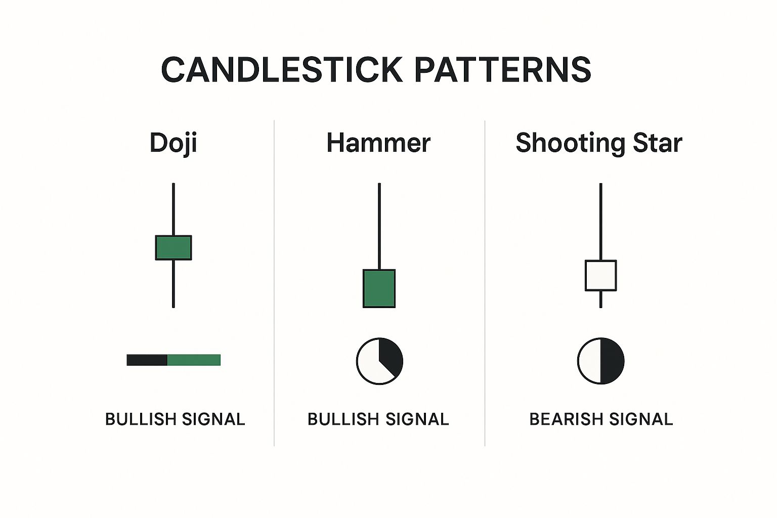
The image clearly contrasts patterns showing indecision (Doji) with those revealing strong buying pressure (Hammer) or selling pressure (Shooting Star), all based on their distinct wick-to-body ratios.
Identifying Bearish Reversals at the Top
Knowing when to buy is only half the battle; knowing when to sell is just as critical. Bearish reversal patterns are the market’s warning signs that a strong uptrend might be hitting a ceiling. They appear at market tops, signaling that buying momentum is fading and sellers are beginning to call the shots.
These bearish formations are often the mirror images of their bullish cousins, just telling the opposite story of a power struggle.
To make it easier to see the relationship between these opposing signals, here’s a quick comparison.
Key Bullish vs. Bearish Reversal Patterns
| Pattern Type | Bullish Pattern | Bearish Pattern | What It Signals |
|---|---|---|---|
| Rejection | Hammer | Shooting Star | A failed push by one side, showing strong rejection at a key price level. |
| Overwhelm | Bullish Engulfing | Bearish Engulfing | A sudden and powerful takeover by the opposing force, swallowing the previous candle. |
| Transition | Morning Star | Evening Star | A three-stage reversal that shows indecision followed by a confirmed shift in control. |
Now, let's take a closer look at those bearish signals.
The Shooting Star is the Hammer's evil twin. It features a small body at the bottom and a long upper wick. This shows that buyers tried their best to push the price to new highs, but sellers aggressively rejected that move and slammed the price right back down.
Next is the Bearish Engulfing pattern. This happens when a large red candle completely swallows the previous green candle, signaling a swift and brutal change in sentiment. Finally, the Evening Star mirrors the Morning Star: a big bullish candle is followed by a small candle of indecision, which is then followed by a decisive bearish candle. It’s a strong sign that the top is in.
By getting comfortable with both bullish and bearish patterns, you arm yourself with a balanced view of the market. You'll be ready to act on signs of weakness at a top just as confidently as you act on signs of strength at a bottom.
Spotting Patterns That Confirm the Trend
Catching a major market reversal is exciting, but knowing when a trend is likely to keep going is often where the real, consistent profits are made. Far too many traders get spooked and exit a perfectly good position, mistaking a temporary pause for a complete change in direction. This is exactly why continuation patterns are a trader’s best friend.
Think of these patterns as the market simply taking a breather. A strong uptrend or downtrend rarely travels in a perfectly straight line; it ebbs and flows. You’ll see powerful bursts of momentum, followed by short periods where the price seems to go sideways before the next major push. Learning to spot these moments of consolidation is what separates disciplined traders from the rest.
The Art of Reading a Pause
So, what are these patterns telling us? They’re signals that a brief moment of market indecision is just that—a pause, not the end of the party. They serve as confirmation that the original momentum, whether bullish or bearish, is still the dominant force at play.
This is a critical piece of understanding candlestick charts, mostly because it helps you master the psychological side of trading. Instead of panicking when a strong trend stalls, you can see the consolidation for what it is and confidently hold your position for the next leg up (or down).
A trend in motion is more likely to stay in motion. Continuation patterns are the footprints that show you the trend is just resting, not reversing, giving you the confidence to ride it further.
The Rising Three Methods
One of the most reliable bullish continuation patterns you'll see is the Rising Three Methods. It’s a five-candle formation that tells a very clear story of resilience. When you see this, it’s a strong sign an uptrend is getting ready to resume its climb.
Here’s how the story plays out on your chart:
- The Big Push: The pattern kicks off with a long, powerful green (bullish) candle, reaffirming the current uptrend.
- The Breather: Next, you’ll see three smaller red (bearish) candles appear. Crucially, these candles all trade within the range of that first big green candle. This shows some selling, but the bears lack the conviction to drive the price down meaningfully.
- The Resumption: The fifth and final candle is another long green one that closes above the high of the very first candle. This is the knockout punch, confirming that the bulls have soaked up all the selling pressure and are back in control.
Visually, it’s a compelling picture: a strong move up, a shallow and brief retreat, followed by an even stronger surge. It’s the market’s way of saying the break is over and the primary trend is back on.
The Falling Three Methods
You can probably guess how this one works. The Falling Three Methods is the bearish twin, signaling that a downtrend is set to continue. It’s the mirror image of its bullish counterpart, providing solid confirmation that sellers are still running the show, even after a weak attempt by buyers to rally.
The pattern unfolds in the opposite direction:
- It starts with a long, decisive red candle that extends the current downtrend.
- This is followed by three small green candles that trade inside the range of the first red candle—a feeble rally attempt that goes nowhere.
- The formation is complete when another powerful red candle appears, closing below the low of the first candle and signaling that the downtrend is kicking back into gear.
By training your eye to spot these key continuation patterns on your OTC Charts MT4 platform, you can learn to filter out the market noise. This skill helps you focus on the dominant trend, avoid exiting winning trades too early, and build the discipline needed to let your profits run.
Trading Smarter with Context and Confirmation
Spotting a candlestick pattern is a great start, but it's really just the beginning of the story. A Bullish Engulfing pattern or a Hammer floating aimlessly in the middle of a chart doesn't mean much—it's just a shape. But when that exact same pattern shows up at a critical price level and other signals are flashing green? That's when it transforms from noise into a high-quality trading opportunity.
This is where real strategy kicks in. Simply trading patterns in isolation, without paying attention to the broader market picture, is a fast track to getting burned by false signals. To graduate from just seeing patterns to actually trading them well, you need to add two crucial layers to your analysis: context and confirmation.
The Power of Confluence
Confluence is a simple but powerful idea: it’s when several different, unrelated analytical tools all point to the same outcome.
Let's say a Hammer pattern appears on your chart. By itself, it’s a decent bullish hint. But what if that Hammer also lands squarely on a major support level? And what if it’s accompanied by a huge spike in trading volume? Now we're talking. This is confluence in action, and it massively boosts the signal's credibility. Instead of acting on a single clue, you now have three separate reasons to believe a reversal is underway.
Think of it like a detective solving a crime. One clue is intriguing, but it won't lead to a conviction. You need multiple pieces of evidence—fingerprints, a motive, and a witness—all pointing to the same person before you can be confident you've got your suspect.
Building Your Confirmation Toolkit
To put this into practice, you’ll want to combine your knowledge of candlesticks with a few other trusted technical analysis tools. These instruments act as your backup, helping to verify what the candles are suggesting.
Here are the three pillars of a solid confirmation strategy:
- Trading Volume: Volume tells you how much conviction is behind a price move. A reversal pattern like a Bullish Engulfing is far more powerful when it happens on high volume. It shows that a significant number of traders are jumping in to push the price in the new direction.
- Support and Resistance Levels: These are historical price zones where buyers or sellers have consistently stepped in. A bullish reversal pattern at a key support level carries much more weight because you already know buyers have defended that price in the past.
- Moving Averages: These indicators smooth out price action and help you see the underlying trend. A bullish pattern has a much better chance of success if the price is already trading above a key moving average (like the 50-day or 200-day), confirming that you're trading in sync with the market's momentum.
By weaving these elements together, you build a much stronger system for validating your trades. This methodical approach is the foundation of any disciplined trading plan. You can sharpen these skills by learning how to backtest trading strategies on past data to see how these confirmations really perform.
This process turns pattern-spotting from a guessing game into a structured, evidence-based approach, helping you make smarter, more confident decisions with a tool like OTC Charts MT4.
Common Questions About Candlestick Trading
As you start to put theory into practice, you're bound to have some questions. That's perfectly normal. Getting straight answers to these common sticking points is how you build the confidence to trade effectively.
Think of this section as a quick FAQ to clear up some of the most frequent questions I hear from traders, helping you move forward with more certainty.
Which Timeframe Is Best for Candlestick Analysis?
This is one of the most common questions, and the honest answer is: it completely depends on you and your trading style. There's no magic "best" timeframe that works for everyone.
- Day traders, who are in and out of the market quickly, will live on the shorter-term charts. Think 1-minute, 5-minute, or 15-minute charts to catch those rapid-fire price movements.
- Swing traders are looking for bigger moves that play out over several days or weeks. For them, the 4-hour and daily charts are the sweet spot.
- Long-term investors need the big picture. They'll zoom way out to the weekly and monthly charts to spot major, long-lasting trends.
The beauty is that the patterns themselves work the same way regardless of the timeframe. The real key is to pick one that fits your personality and strategy, and then stick with it to build consistency.
How Reliable Are Candlestick Patterns?
This is a crucial point. Candlestick patterns are incredibly useful for gauging market sentiment and probability, but they are not a crystal ball. Think of them as strong hints about what might happen next, not guarantees.
Their true power is unlocked when you use them as part of a complete strategy. A bullish engulfing pattern at a major support level, confirmed by a surge in volume, is a much higher-probability signal than one that just shows up randomly in the middle of a range.
Never, ever trade on a pattern alone. Always look for confirmation from other tools in your arsenal—like volume, support and resistance levels, or your favorite indicator—to back up what the candles are telling you. This simple habit will save you from countless false signals.
Can I Use Candlesticks for Any Market?
Yes, absolutely. This is what makes learning them so valuable. Since candlesticks simply visualize the universal battle between buyers and sellers, their principles apply to any market driven by supply and demand.
This includes:
- Stocks
- Forex
- Cryptocurrencies
- Commodities
- Indices
The emotions of fear, greed, and indecision are human universals, and they show up on a chart the same way whether you're trading Apple stock or Bitcoin. This makes candlestick analysis one of the most versatile and portable skills you can develop as a trader.
Ready to apply this knowledge with professional-grade tools? OTC Charts MT4 provides instantaneous and precise OTC quotes directly from Pocket Option, seamlessly integrated into MetaTrader 4. Elevate your binary options trading strategy by visiting the official OTC Charts MT4 website and gain a competitive edge in any market condition.