
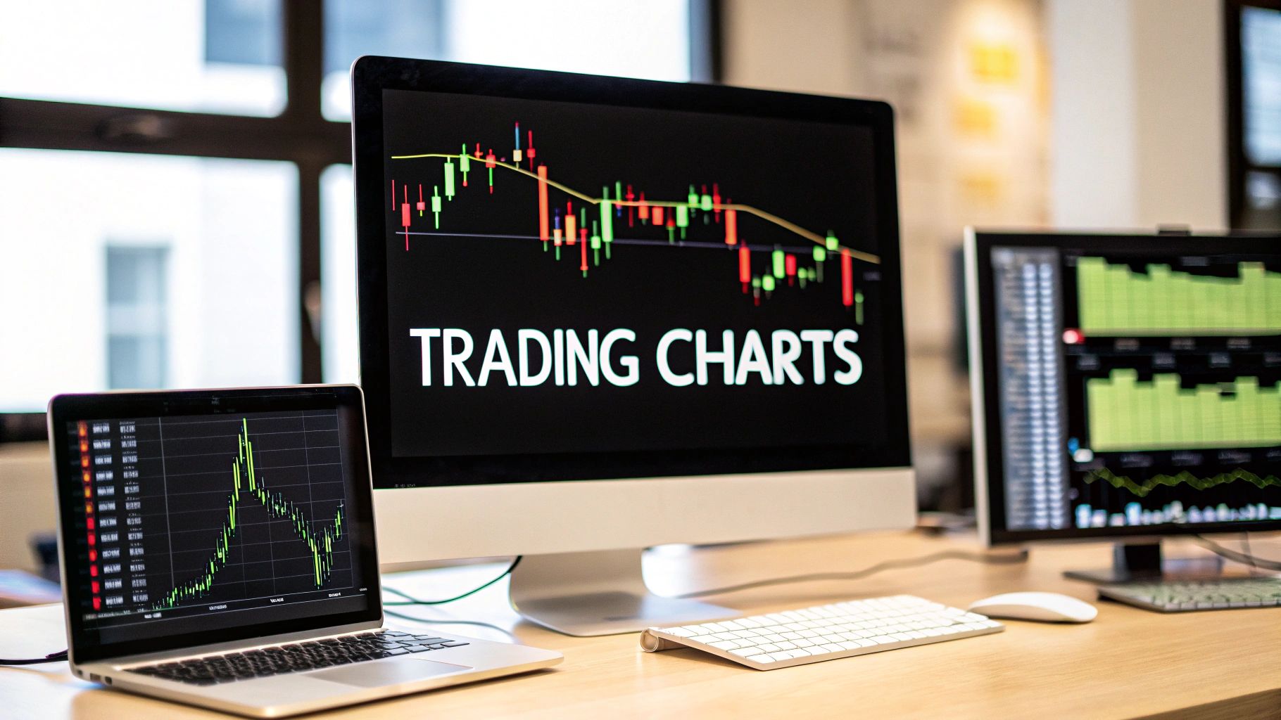
Let's be honest, staring at a trading chart for the first time can feel overwhelming. It looks like a complex mess of lines, bars, and colors. But at its heart, a trading chart is simply a visual story of an asset's price over time. Learning to read these charts isn't just a helpful skill; it's the absolute foundation of trading. It’s what separates a calculated decision from a blind guess.
How to Read the Story of the Market
Think of a trading chart like a sophisticated weather map for the financial markets. It doesn't predict the future with 100% certainty, but it uses historical data to show you patterns of what’s likely to come. Every chart is built on two simple axes that work together to tell this story.
The vertical axis (the Y-axis) tracks the asset's price. The higher up the chart, the higher the price. The horizontal axis (the X-axis) represents time. This could be anything from seconds and minutes to months and years, depending on the timeframe you’ve selected. These two axes plot the price at different moments, revealing the constant tug-of-war between buyers (bulls) and sellers (bears).
The Building Blocks of a Chart
To really start understanding trading charts, you need to know their core components. These elements are the same everywhere, whether you're trading stocks, forex, or exploring the OTC markets on a platform like OTC Charts MT4. Once you nail these fundamentals, the chart starts to make sense, and you're ready to learn its deeper language.
Before we dive into the different types of charts, let's break down the essential pieces you'll find on every single one. This table summarizes the absolute must-know components.
The Core Components of a Trading Chart
| Component | What It Represents | Why It's Important |
|---|---|---|
| Price Axis (Y-axis) | The price scale of the asset. | Tells you the "what"—what is the asset's current value? |
| Time Axis (X-axis) | The time intervals (e.g., minutes, days). | Tells you the "when"—when did these price changes occur? |
| Price Action | The movement of the price over time. | This is the "story" itself, forming the patterns you'll analyze. |
These three elements are the bedrock of technical analysis. They are the raw data from which all insights are drawn.
A trading chart does more than show numbers; it visualizes market psychology. Every rise and fall represents the collective fear, greed, and sentiment of thousands of traders reacting to market events in real time.
Why Historical Data Matters
Seeing past price action isn't just a history lesson; it's about using that information to form educated guesses about the future. Consider the charts for major indices like the Dow Jones Industrial Average (DJIA), which span over 100 years and reflect the entire journey of the U.S. economy.
By studying decades of data—through booms, busts, the 2008 financial crisis, and beyond—traders can spot powerful, recurring trends and price levels that have held significance throughout history. This long-term perspective, which you can see on a century-long chart at Macrotrends.net, provides an invaluable context for making grounded trading decisions today.
Choosing Your Chart: Line, Bar, or Candlestick?
Think of trading charts as different ways of telling the market's story. Some give you just the headlines, while others provide a detailed, play-by-play account. The right one for you depends entirely on what kind of information you're looking for to inform your trades. Let's walk through the three main types you'll see everywhere.
The most straightforward is the Line Chart. It’s like glancing at a newspaper headline—it simply connects the closing prices over a specific timeframe with a single, continuous line. This gives you a very clean, high-level view of an asset's price movement, perfect for spotting the overall trend without any noise. Its biggest strength, simplicity, is also its weakness; it completely glosses over the price battles that happened during the day.
Digging a Little Deeper with Bar Charts
When you need more than just the headline, you can turn to a Bar Chart. Also known as an OHLC chart (Open, High, Low, Close), this is like reading the first paragraph of the news story. Each individual bar represents a trading period and packs in four key pieces of data:
- Open: The small horizontal tick on the left side of the bar.
- High: The very top of the vertical bar.
- Low: The very bottom of the vertical bar.
- Close: The small horizontal tick on the right side.
This extra information gives you a much better feel for the price range and volatility within each session. It's a big step up from the line chart because it starts to show the struggle between buyers and sellers.
The Most Popular Storyteller: Candlestick Charts
Now for the crowd favorite. The Candlestick Chart tells the richest, most visual story of them all. This method, which has its roots in 18th-century Japan with rice traders, gives you the same four data points as a bar chart but in a format that's incredibly intuitive.
A candlestick chart doesn't just show you numbers. It visualizes the raw psychology of the market—the constant tug-of-war between bullish buyers and bearish sellers in real-time.
Each "candle" has a "body" and "wicks" (sometimes called shadows). The thick body shows the range between the opening and closing price. It's usually colored green if the price closed higher than it opened (a bullish sign) and red if it closed lower (a bearish sign). The thin wicks sticking out show the highest and lowest prices reached during that period. This visual design makes spotting patterns and judging market momentum far easier, which is why it’s the go-to for most traders, especially those using platforms like OTC Charts MT4.
A Comparison of Common Chart Types
To help you choose the right tool for the job, here’s a side-by-side look at what each chart type brings to the table. This comparison should clarify which one aligns best with your trading style and analytical needs.
| Chart Type | Best For | Information Provided | Key Advantage |
|---|---|---|---|
| Line Chart | Identifying long-term trends and getting a quick, clean overview. | A single data point: the closing price. | Simplicity and clarity; removes market noise. |
| Bar Chart (OHLC) | Analyzing volatility and price ranges within specific periods. | Four data points: Open, High, Low, and Close. | More detailed than a line chart, showing the full trading range. |
| Candlestick Chart | Visually identifying price patterns and gauging market sentiment quickly. | Four data points: Open, High, Low, and Close. | Highly visual and intuitive; makes interpreting market psychology easier. |
Ultimately, the choice comes down to what you're trying to achieve. Each chart offers a different lens through which to view market activity.
This visual summary does a great job of showing what data you get from each chart type.
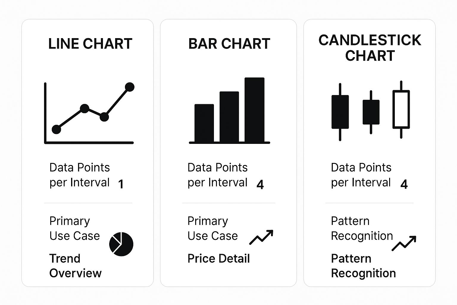
As you can see, while a line chart provides just one data point for a simple trend line, both bar and candlestick charts deliver four. This makes them far better suited for in-depth analysis and finding trading patterns.
So, which one should you use? If you're a long-term investor who just wants to keep an eye on the general direction of the market, a line chart might be all you need. But if you're an active trader who needs to understand price action, volatility, and market psychology, the candlestick chart is hands-down the most powerful tool for understanding trading charts.
Reading the Emotions in Candlestick Patterns
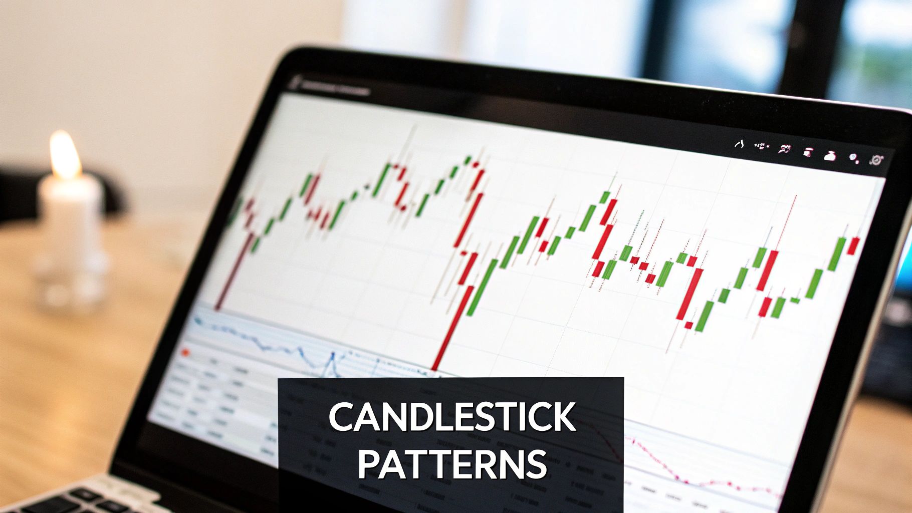
If you really want to get good at understanding trading charts, you have to learn to read the story they're telling. Candlesticks aren't just data points; they're the visual language of market psychology, translating the constant tug-of-war between buyers and sellers into a clear picture.
To become fluent, you need to know the basic anatomy. Each candle has a body (the thick part) and wicks (the thin lines, sometimes called shadows). The body shows you the distance between the opening and closing price for a given period, while the wicks show the highest and lowest points the price hit during that same time.
The color and size of the body are your first major clues. A long green (or bullish) body is a sign of confidence—buyers were in charge and pushed the price way up. On the flip side, a long red (or bearish) body means sellers had the upper hand, driving the price down hard.
Decoding Individual Candle Signals
Even a single candlestick can tell you a surprising amount about what traders were thinking and feeling. Think of it as a snapshot of the market's mood. The wicks are often the most revealing part.
Long wicks are a dead giveaway for volatility and indecision. For instance, a long upper wick shows that buyers made a valiant effort to push prices higher, but sellers fought back and slammed it down before the session closed. That rejection of higher prices is a classic bearish signal.
A long lower wick tells the opposite story. Sellers tried to tank the price, but buyers swooped in with enough force to prop it back up. This rejection of lower prices is a powerful bullish signal, hinting that buying pressure is building beneath the surface.
Moving From Candles to Powerful Patterns
While one candle gives you a hint, the real magic happens when they form patterns over time. These are recognizable formations of one or more candles that often predict whether a trend will continue or reverse. Learning to spot them is a cornerstone of technical analysis.
Candlestick patterns are like seeing storm clouds gather before it rains. They don't guarantee what will happen next, but they give you a high-probability heads-up that market conditions are changing.
Let's break down some of the most common and reliable patterns you'll see on platforms like OTC Charts MT4. Getting these three down will give you a fantastic foundation for reading price action.
Essential Candlestick Patterns to Know
Learning to spot these key formations can seriously level up your ability to anticipate where the market might go next.
-
The Doji: This unique candle forms when the opening and closing prices are nearly identical, resulting in a tiny, almost nonexistent body. It looks like a plus sign or a cross and screams indecision. When a Doji appears after a strong trend, it can often signal an impending reversal.
-
The Hammer: This is a classic bullish reversal signal you'll find at the bottom of a downtrend. It has a short body at the top with a long lower wick that's at least twice the length of the body. It literally looks like a hammer, as if the market is "hammering out" a bottom.
-
The Engulfing Pattern: This potent two-candle reversal pattern tells you who just took control. A Bullish Engulfing pattern occurs when a small red candle is completely swallowed by the next, much larger green candle, showing buyers have overwhelmed the sellers. A Bearish Engulfing pattern is the opposite: a small green candle is dwarfed by a large red one, signaling sellers are now firmly in charge.
By learning to see these emotional footprints, you stop just looking at prices and start reading the market's story. That's the real key to understanding trading charts.
Your Essential Chart Analysis Toolkit
A chart packed with data is just noise until you have the right tools to make sense of it. Staring at raw candlesticks won't get you very far. You need a solid analytical toolkit to decode what the market is telling you and turn that story into a real trading plan.
Think of these tools as the fundamental building blocks for understanding trading charts. They're how you bring order to the chaos, pinpoint where buyers and sellers are digging in their heels, and add crucial context to every price swing. Getting a handle on these is the next real step toward making confident, well-reasoned decisions.
Drawing the Lines of Battle: Support and Resistance
Picture the price of an asset bouncing around inside a room. The floor it keeps hitting and rebounding from? That's support. The ceiling it bumps its head on and can't seem to break? That's resistance. These are, without a doubt, the most important levels you can draw on any chart.
- Support is a price zone where a downtrend tends to run out of steam because buyers are waiting. As the price falls to this level, traders see a potential bargain and start buying, propping it up.
- Resistance is the opposite. It’s a price ceiling where an uptrend often stalls out because sellers decide it's a great time to take profits, overwhelming the buyers.
Here's where it gets interesting: when the price smashes through a resistance level, that old ceiling often becomes the new floor (support). And when a support level gives way, it can flip and become the next ceiling (resistance). Marking these zones on your chart is like creating a battlefield map—it shows you exactly where the big fights are likely to happen.
Support and resistance aren't laser-precise lines; they are zones. Think of them as areas of market psychology, where the collective memory of past price action heavily influences what traders do next.
Confirming Moves with Volume
If price tells you what happened, volume tells you how much conviction was behind the move. Volume is simply the total number of shares or contracts that changed hands in a given period. It’s like the roar of the crowd at a game—a big play is way more convincing when the stadium is packed and screaming than when it's completely empty.
A price spike on high volume is a big deal. It shows that a lot of traders are participating and believe in the direction. A breakout above resistance on a massive volume surge often signals the start of a powerful new trend. On the flip side, a price move on weak, low volume is suspicious and might be a "fakeout" waiting to trap you. Always glance at the volume bars to confirm if a move has real strength behind it.
Choosing Your Lens with Timeframes
The timeframe you choose for your chart is like picking the right lens for your camera. A daily chart might paint a picture of a steady, long-term uptrend. But if you zoom into a 5-minute chart of that same asset, you could easily see a sharp, short-term downtrend. Neither chart is "wrong"—they're just showing you different perspectives of the same market story.
Common timeframes fall into a few buckets:
- Long-Term: Daily, Weekly, Monthly (often used by investors)
- Medium-Term: 1-Hour, 4-Hour (popular with swing traders)
- Short-Term: 1-Minute, 5-Minute, 15-Minute (the domain of day traders)
Seasoned traders rarely stick to just one. They practice multi-timeframe analysis, maybe identifying the main trend on a daily chart and then dropping down to a 4-hour chart to find a more precise entry point that lines up with the bigger picture. This technique is a game-changer, and you can see its power by learning how to backtest trading strategies across different chart settings.
This principle is universal. For example, traders analyzing global stock indexes like Australia's ASX 200 or Africa's NSE All Share look at live data across multiple timeframes. In May 2021, the ASX 200 might have shown a minor daily dip of -0.21%, but its year-to-date gain was still a healthy 6.52%. This highlights how different timeframes tell different parts of the story. You can explore data for these and other global indices on sites like TradingEconomics.com.
Adding Indicators to Confirm Your Analysis
If drawing trend lines is like sketching a map of the market, then technical indicators are your compass and altimeter. They’re mathematical tools that cut through the noise, using price and volume data to give you a clearer picture of what’s happening beneath the surface. They help you confirm what you think you see and make decisions with more conviction.
The point isn't to plaster your chart with a dozen different lines and oscillators. That just leads to confusion, a classic case of analysis paralysis. Instead, the real skill lies in mastering just one or two that work well together. For our purposes, we'll look at a classic combination: one indicator to identify the trend and another to measure its strength.
Smoothing Out the Noise with Moving Averages
One of the first indicators most traders learn is the Moving Average (MA), and for good reason. Think of it as a tool for smoothing out the chaotic, day-to-day price swings. It does this by calculating the average price over a set period—say, the last 20 days—and plotting it as a single, flowing line on your chart.
This smoothed-out line makes it incredibly easy to spot the underlying trend. Is the price consistently staying above the MA? That's a good sign of an uptrend. If it's stubbornly trading below the MA, you're likely in a downtrend. Traders also keep a close eye on crossovers, which happen when the price cuts through the moving average. These can be early warnings that the prevailing trend is about to change course.
Gauging Market Momentum with the RSI
So, the moving average tells you which way the market is heading. But how much gas is left in the tank? That's where a momentum oscillator like the Relative Strength Index (RSI) comes in. Think of it as the tachometer for the market; it tells you if the engine is revving too high or about to stall.
The RSI appears as a line in a separate window below your price chart, moving between 0 and 100. Its job is to measure the speed and magnitude of recent price changes to flag potentially overbought or oversold conditions.
- Overbought (above 70): When the RSI pushes above the 70 level, it’s a warning that enthusiasm might be getting a little out of hand. The buying pressure could be nearing exhaustion, and the asset may be due for a correction.
- Oversold (below 30): When the RSI dips below the 30 level, it suggests that the sellers have pushed the price down too far, too fast. The asset might be undervalued, and a bounce could be on the horizon.
A common rookie mistake is to immediately sell when the RSI hits 70 or buy the second it drops to 30. A more seasoned approach is to wait for the RSI to cross back out of those zones. That return trip often provides a much stronger signal that momentum has truly shifted.
This kind of layered analysis isn't just for individual stocks. Take a major market index like the US500. Back in May 2021, the index was sitting around 5,902 points. By applying these same principles, analysts could see past the daily noise and understand the broader trends and market psychology at play. You can see historical data and analysis for major indexes on platforms like TradingEconomics.com.
Combining price action with indicators like the MA and RSI creates a powerful system of checks and balances. Using an MA to confirm the direction and an RSI to measure the strength is a fundamental part of building a solid trading strategy. To keep your rules clear and your execution sharp, it helps to formalize this process with a comprehensive trading plan template.
A Practical Chart Analysis Walkthrough
Alright, enough with the theory. The only way to get good at reading charts is to actually do it. Let’s put everything we've talked about into practice and walk through a chart analysis from start to finish. I'll show you how a trader goes from a blank screen to building a solid trading idea.
Think of this as layering information. Each step adds another piece to the puzzle, turning a simple price chart into a strategic map that tells a story about the market.
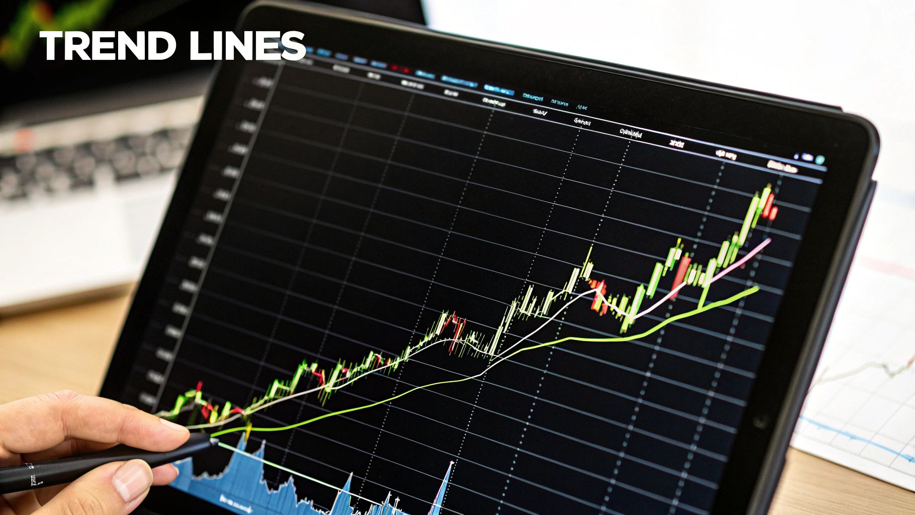
Step 1: Start with a Clean Chart and Find the Trend
First things first: forget the fancy indicators for a moment. Pull up a clean chart and ask the most basic question: which way is the market going? Is it generally heading up, down, or just chopping sideways?
A simple trend line is your best friend here. If you see a series of higher lows, connect them to draw an uptrend line. If you see lower highs, connect those for a downtrend line. A moving average (MA) can also cut through the noise and give you a smoothed-out view of the main direction. This is your foundation—everything else builds on this.
Step 2: Mark Key Support and Resistance Levels
Once you know the trend, it’s time to identify the battlegrounds. These are the horizontal support and resistance levels where price has struggled to break through in the past. Look across the chart for previous peaks (resistance) and valleys (support) and draw horizontal lines there.
These levels are like the market's memory. They represent price points where buyers and sellers have historically stepped in, making them prime candidates for future price reactions. Marking these zones gives you a clear framework for figuring out where to enter, where to take profits, and where to place your stop-loss.
I like to think of this as building a case. The trend is your main lead, support and resistance are key locations of interest, and indicators are the forensic evidence you bring in to confirm your suspicions.
The OTC Charts MT4 platform, shown below, lets you see how all these elements work together.
Notice how the price seems to "respect" the trend lines and horizontal levels we’ve drawn. This creates a predictable structure that we can build a strategy around.
Step 3: Layer in Indicators to Gauge Momentum
With our core price structure mapped out, it's time for the final layer of confirmation. Let's add an oscillator like the Relative Strength Index (RSI) to get a feel for the momentum behind the price moves. Is the trend losing steam, or is it just getting started?
Here’s a classic scenario. Imagine the price is dropping toward a strong support level you’ve already marked. You see that selling volume is picking up, which tells you sellers are aggressive. But then you glance down at your RSI and see it's dipping below 30 into "oversold" territory.
This is the kind of conflicting evidence that gets a trader's attention. The price and volume are screaming "down," but the RSI is whispering that the sellers might be getting exhausted. This is your cue to watch that support level like a hawk for a potential bounce or reversal. This kind of layered analysis is what creates a high-probability trading setup, and tracking these observations in a journal is non-negotiable for serious improvement, as you can see in these trading journal examples.
Got Questions About Trading Charts? We've Got Answers.
Even after you get the hang of the basics, some questions always seem to linger. Let's tackle some of the most common ones head-on. My goal here is to give you straight, practical answers that will help you read the market with more confidence.
Which Chart Timeframe Should a Beginner Use?
There's no magic bullet here—the "best" timeframe really boils down to your personal trading style and how much time you can dedicate. That said, most traders just starting out find their footing on the daily or 4-hour charts.
Why? Because these longer timeframes move at a much more manageable pace. Unlike the frantic energy of a 1-minute or 5-minute chart, they give you breathing room to analyze what's happening and make a decision without feeling like you're in a pressure cooker.
A great habit to build early on is multi-timeframe analysis. Think of it like using Google Maps. You start with the satellite view (the daily chart) to see the main highway—the dominant trend. Then, you zoom in to the street view (the 1-hour chart) to find the perfect spot to park—your precise entry and exit points.
How Many Indicators Are Too Many?
When it comes to indicators, less is definitely more. One of the biggest traps for new traders is clogging their charts with so many lines and oscillators that it just creates noise. This is called "analysis paralysis," and it’s a real account-killer. A clean chart leads to clear thinking.
A solid, clean setup to start with is just two indicators that work well together:
- A trend indicator, like a Moving Average, to help confirm the market's general direction.
- A momentum oscillator, like the RSI, to measure the strength behind a price move.
Remember, indicators aren't meant to be a crystal ball. Their job is to confirm what you're already seeing in the price action itself. If your chart starts to look like a modern art masterpiece, you’ve gone too far. Simplify.
Are Chart Patterns Actually Reliable?
Not 100% of the time, and it's critical to understand that. No pattern, indicator, or strategy is foolproof. Understanding trading charts is all about playing the probabilities, not predicting certainties. Patterns give you high-probability clues about what might happen next, but they can—and often do—fail.
This is exactly why solid risk management is the bedrock of all successful trading. Always use a stop-loss to define your maximum risk before you even enter a trade. And just as important, only risk a small fraction of your capital on any single idea. Think of chart patterns as a powerful tool, but never mistake them for a guarantee.
What's the Difference Between Technical and Fundamental Analysis?
This is a core concept in trading. Technical analysis, which is what we've been focused on, is the art of studying price history on a chart. Technicians believe that all known information—from earnings reports to investor sentiment—is already baked into the price you see.
Fundamental analysis, on the other hand, is like being a detective for a company's health. It involves digging into financial statements, economic reports, industry trends, and the quality of a company's leadership to determine an asset's "true" value.
Many of the best traders use a hybrid approach. They might use fundamental analysis to decide what to trade (e.g., finding a strong company in a booming sector). Then, they switch to technical analysis to decide when to pull the trigger, waiting for the price to pull back to a key support level or form a bullish pattern on the chart.
Ready to put this knowledge to work with top-tier tools? OTC Charts MT4 gives you the most precise, real-time OTC data from Pocket Option, all within the powerhouse MetaTrader 4 platform. Stop guessing and start analyzing with clarity. See what you've been missing by visiting OTC Charts MT4 today.